
Schrift Shop. A typography-first commerce layer for books, specimens, and collective editions
Some shops are built around products. Others are built around a world. Schrift Shop belongs to the second kind: a place for books, posters, bags, printed matter, and small objects that all come from the same publishing culture. It had to work as an online store, but it could not feel like a generic grid of things to buy.
The site needed to hold the physical character of Schrift Publishers — the weight of books, the details of printing, the rhythm of editorial work — and translate it into a digital system. Not by imitating paper on screen, but by making a shop with the same care, restraint, and attention to material as the objects themselves.
Context · See also Schrift Foundry case
Schrift Publishers works with visual culture, typography, publishing, research, and printed matter. Schrift Shop is the place where this world becomes accessible as objects: books, posters, bags, archival finds, gifts, and works by publishers and artists close to the project in spirit.
For the publisher, the shop is not only a sales channel. It is part of the infrastructure that supports new books, research, authors, and the wider Schrift ecosystem. The project therefore had to do more than organise products. It had to give the publisher a stable digital foundation: expressive enough for a cultural project, practical enough for real e-commerce, and flexible enough to grow with future releases.


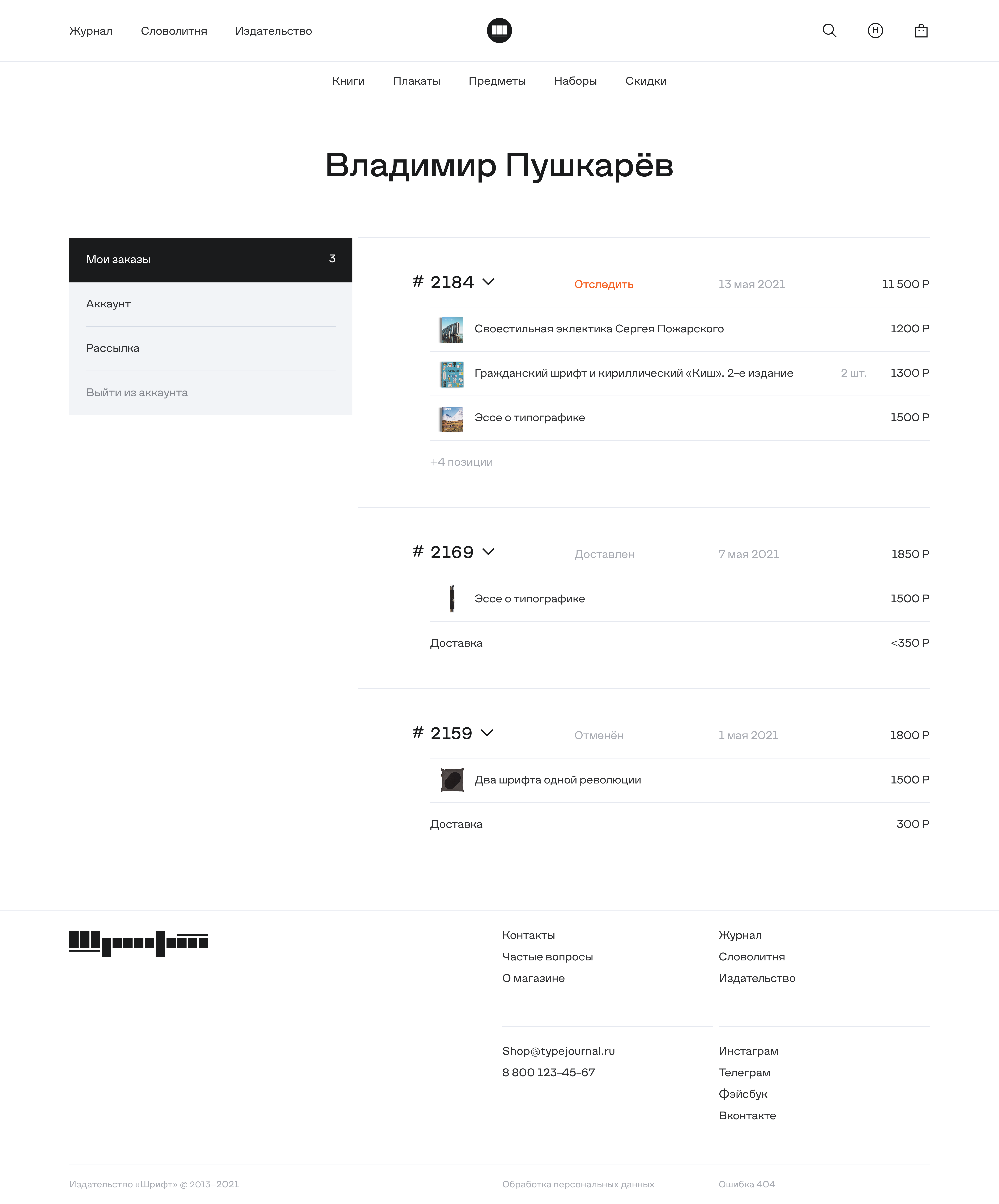
The challenge was not only to design a shop, but to build a complete product system around a small publishing universe. The site had to move between atmosphere and utility: large visual moments, product stories, book details, categories, filters, cart, checkout, user account, order logic, and all the quiet functional states that make a store work.
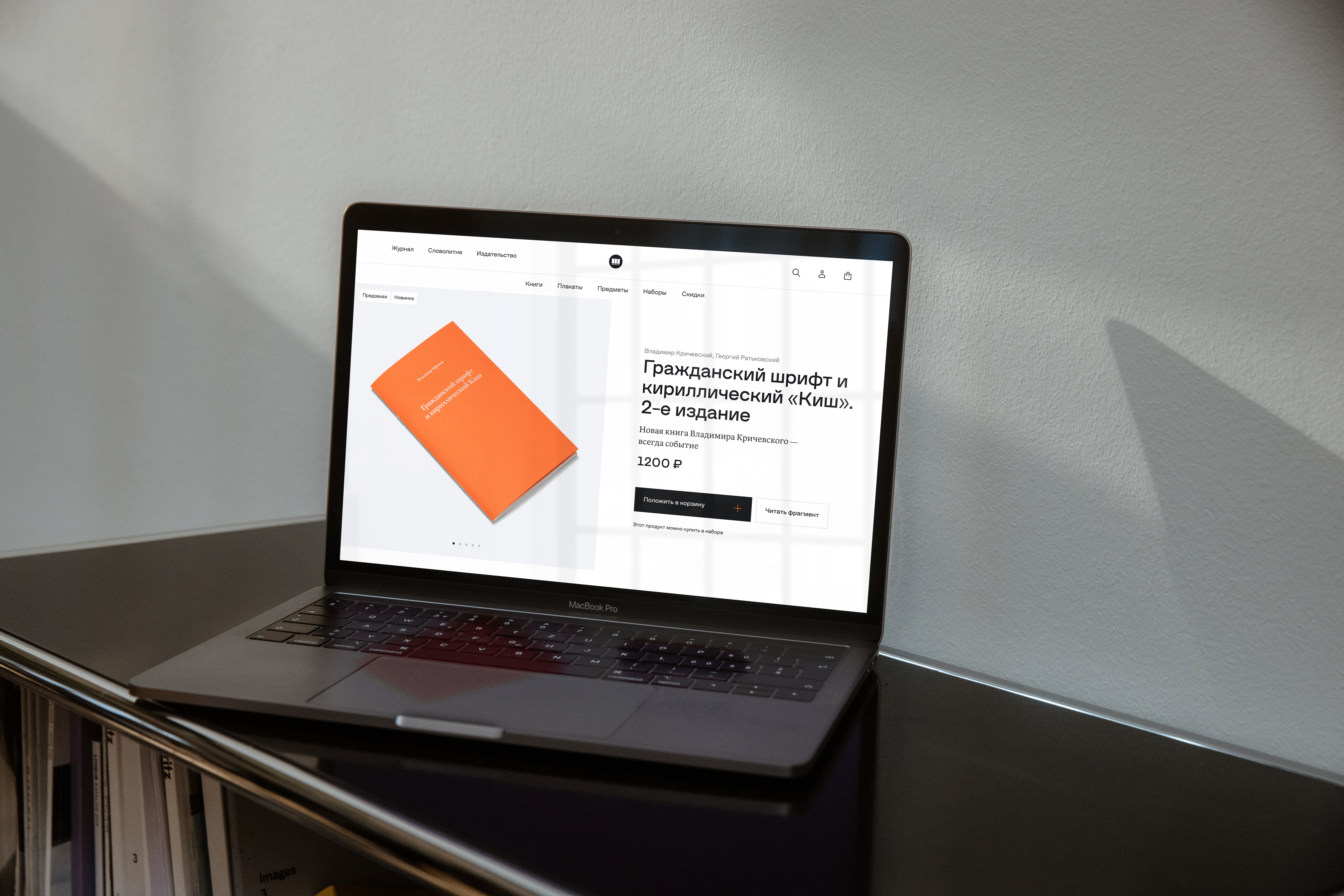
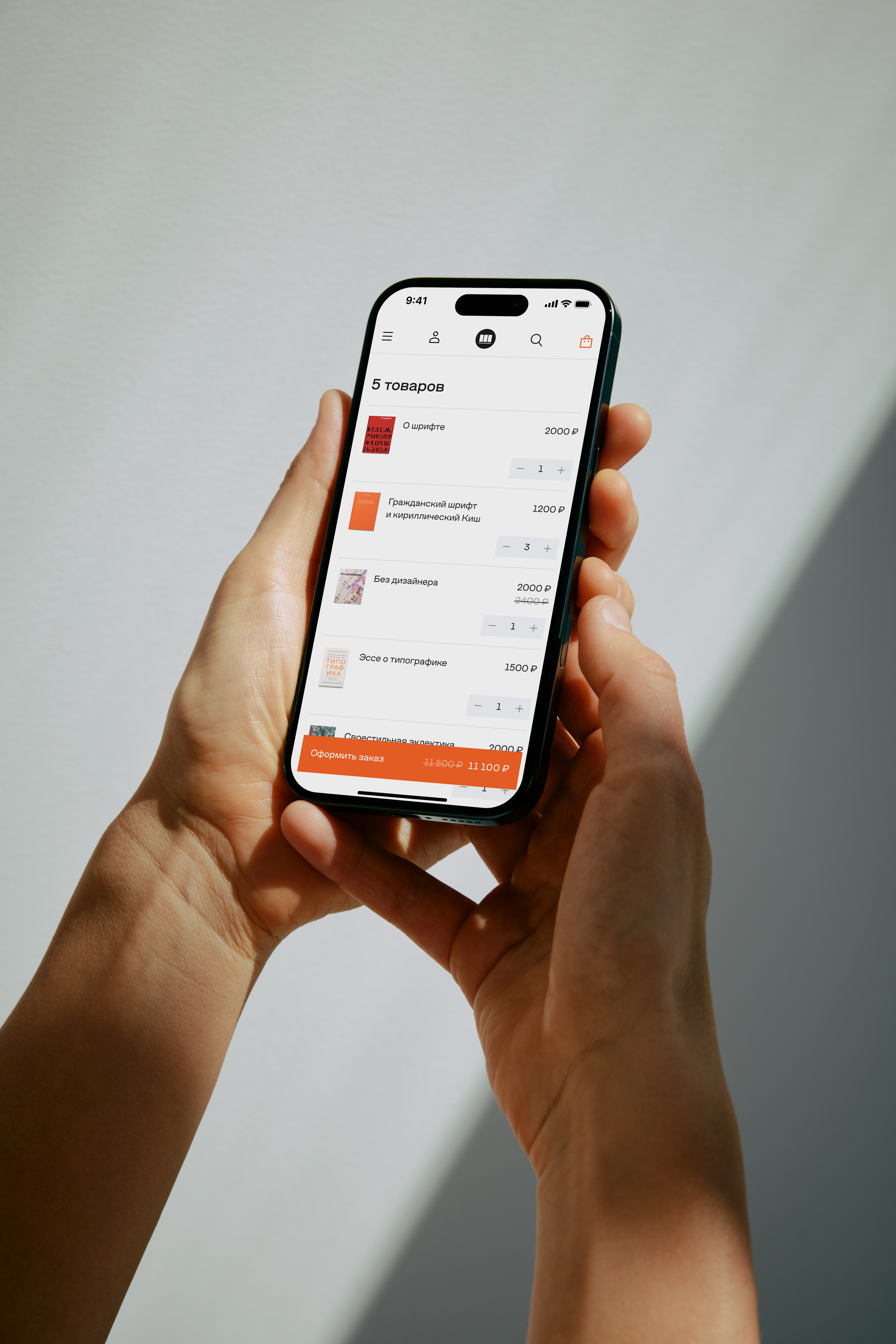
This made the project much larger than a simple storefront. The full route was designed from the homepage to the personal account, with a detailed design system and a broad set of components. Every key screen was drawn in three sizes — desktop, tablet, and mobile — so the shop could keep its character across formats without losing clarity or becoming decorative at the expense of use.

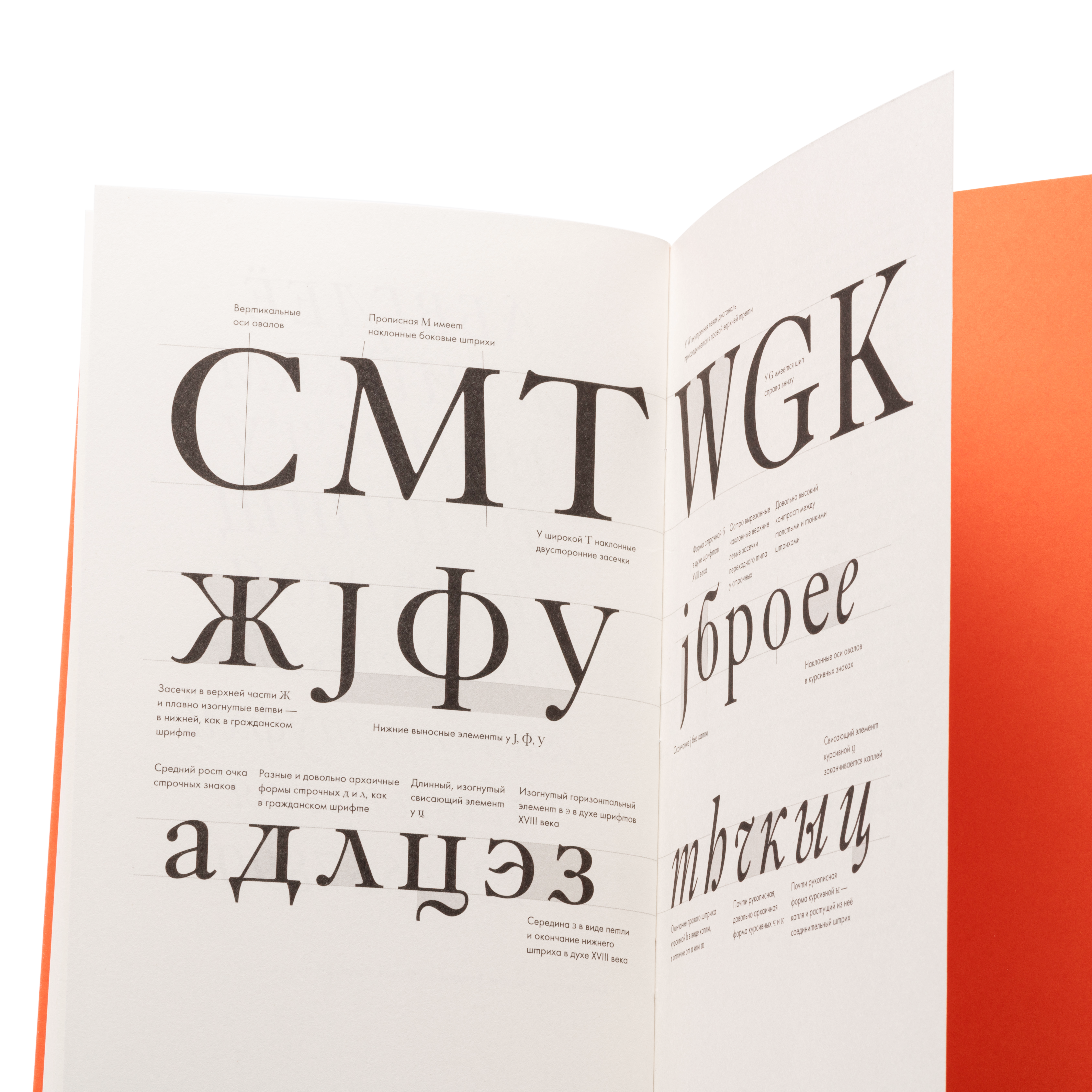

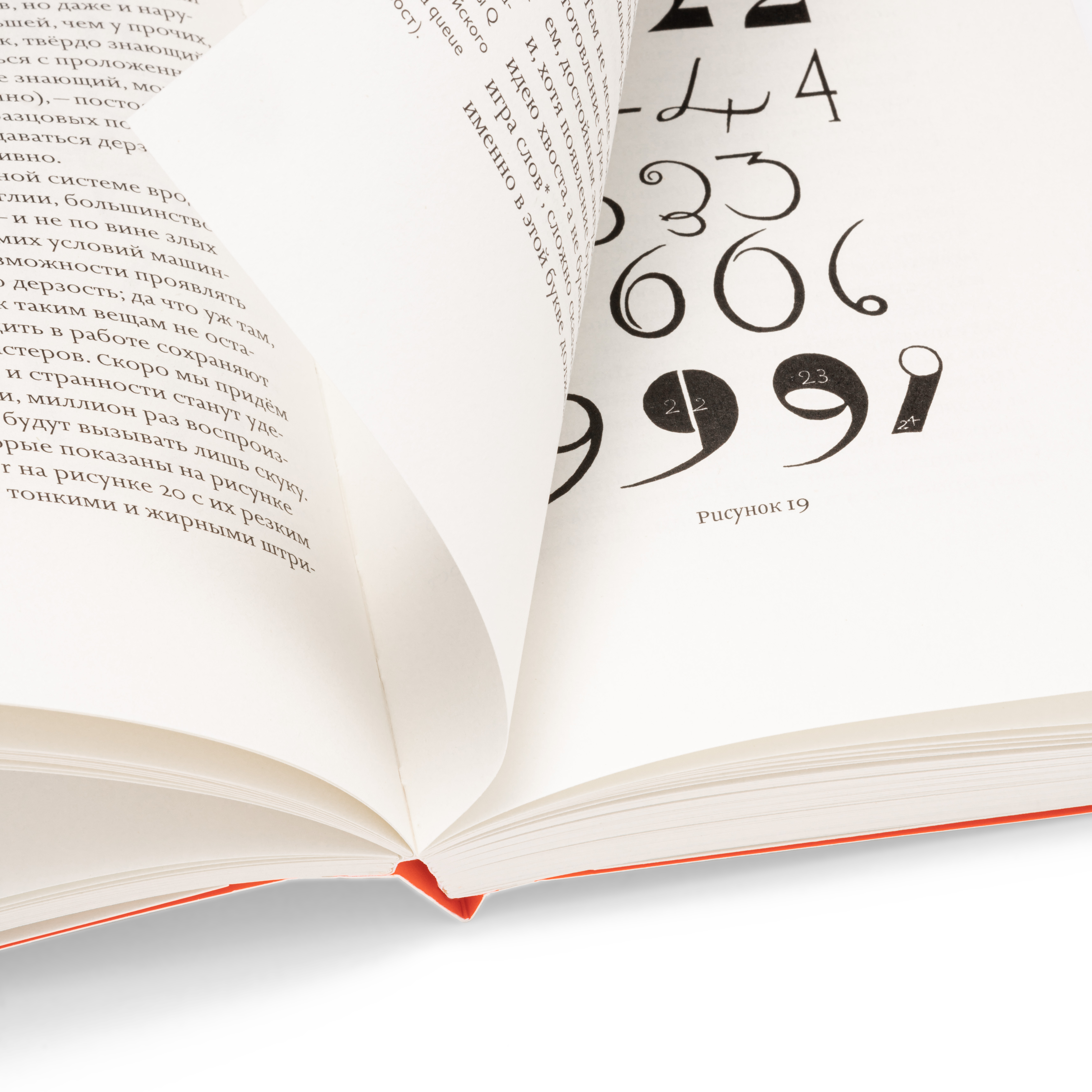


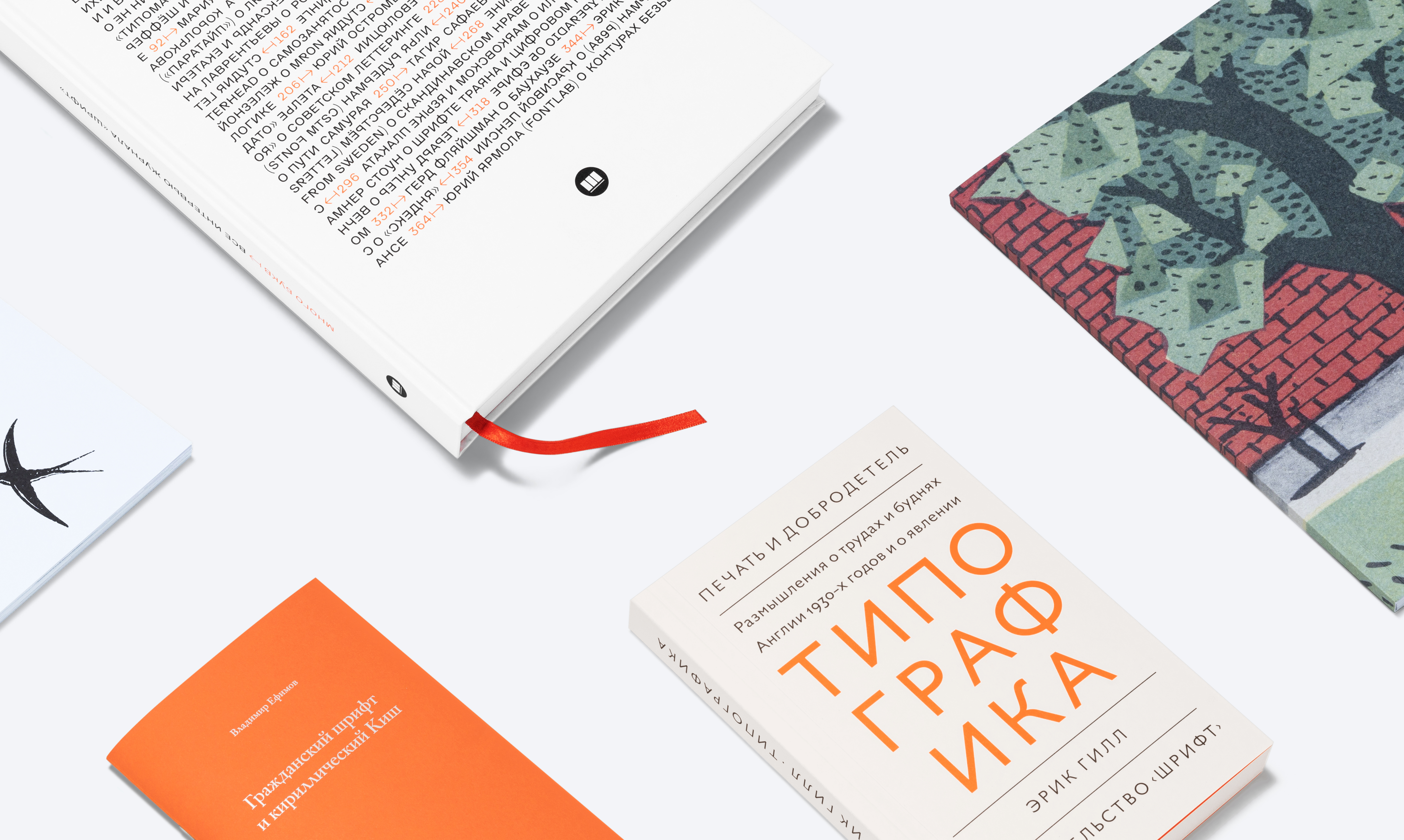
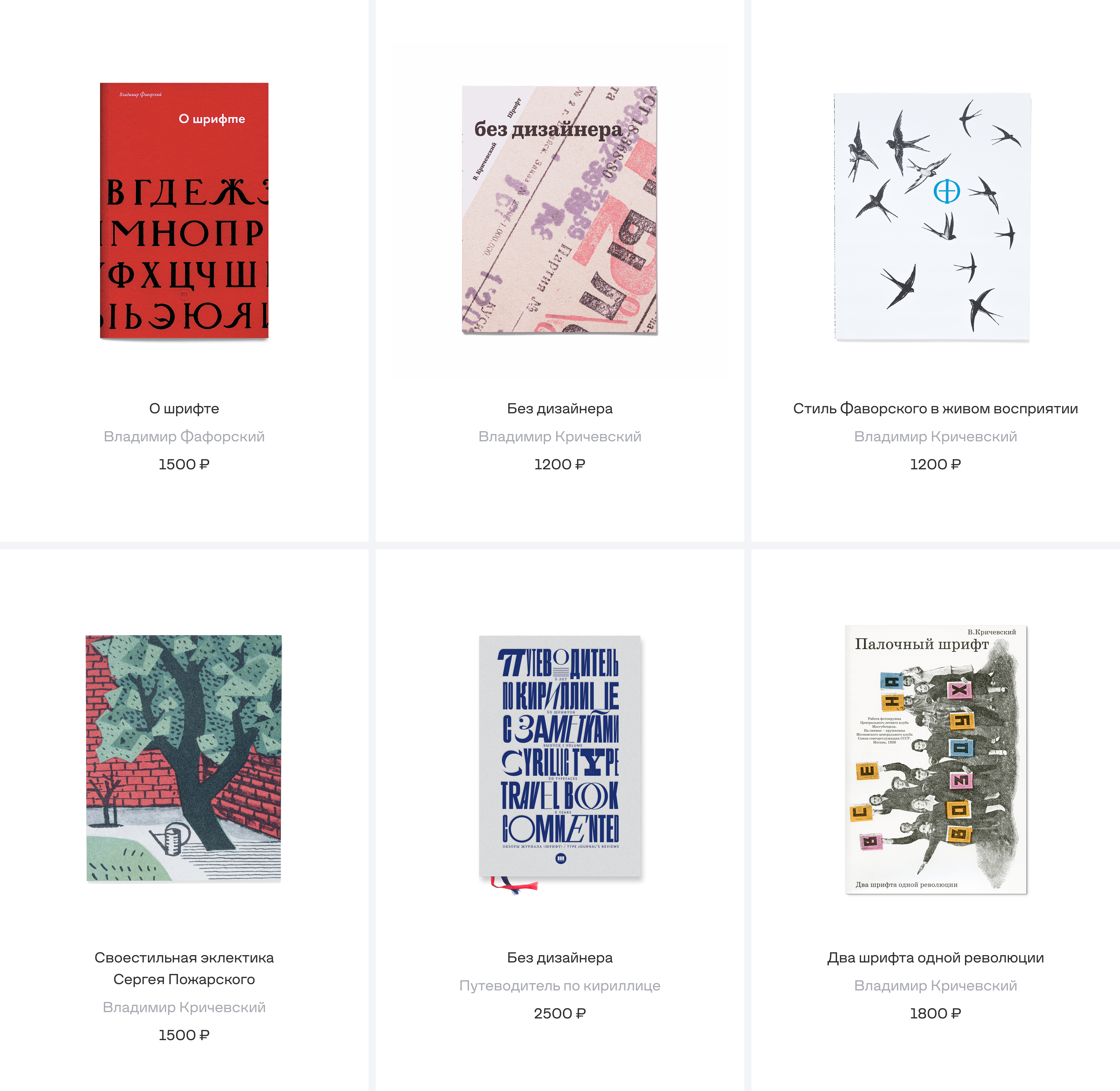
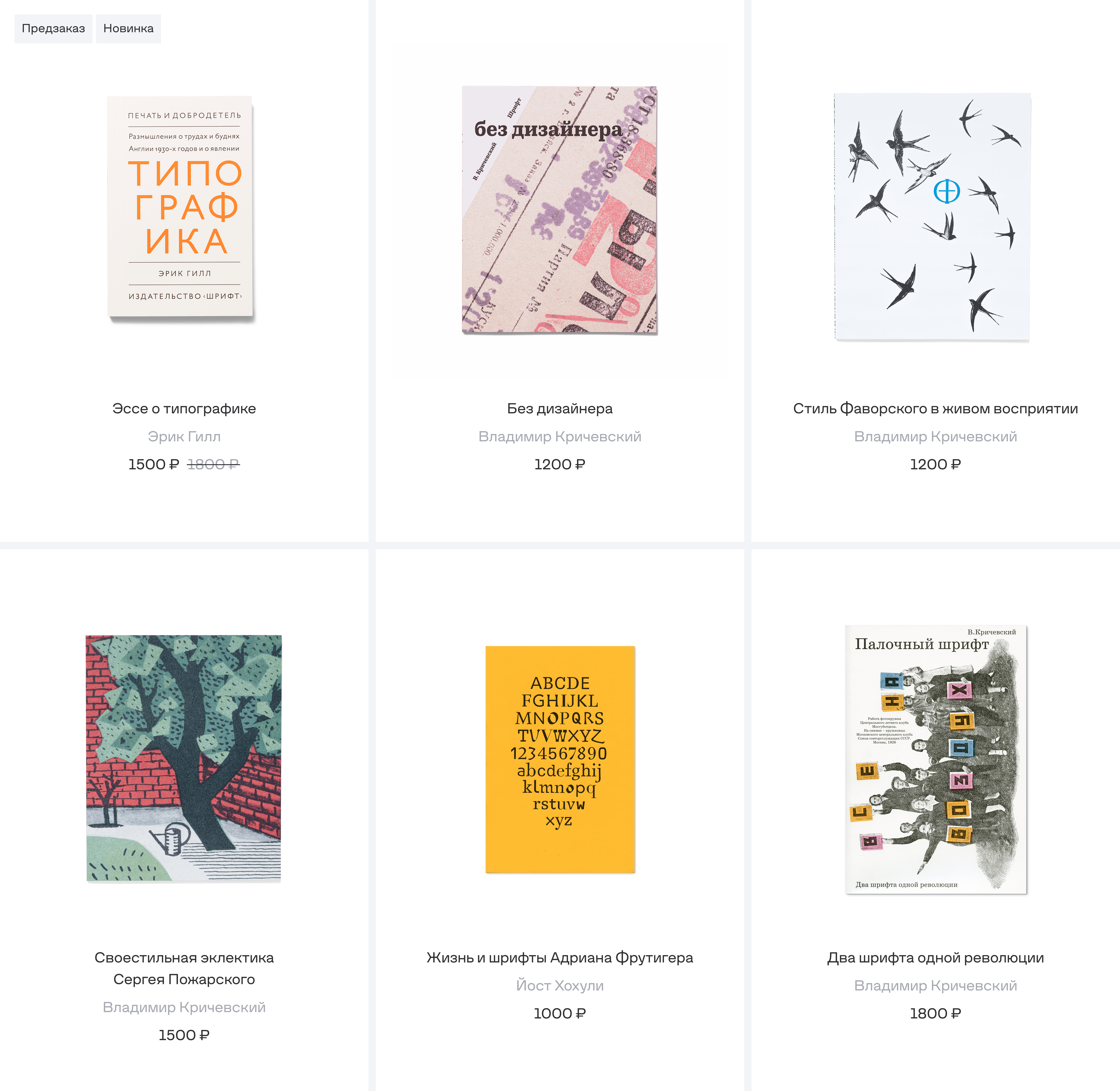
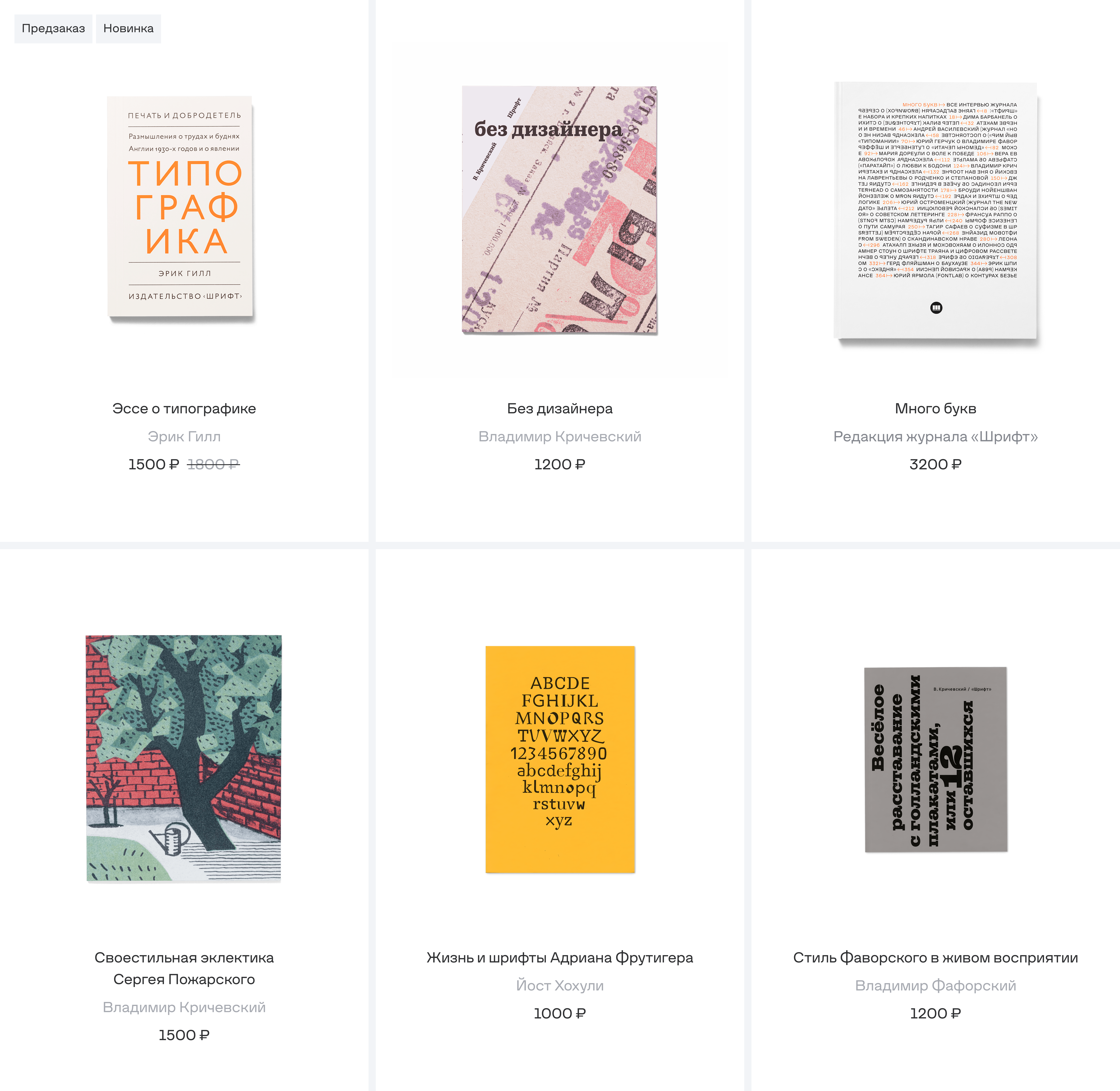
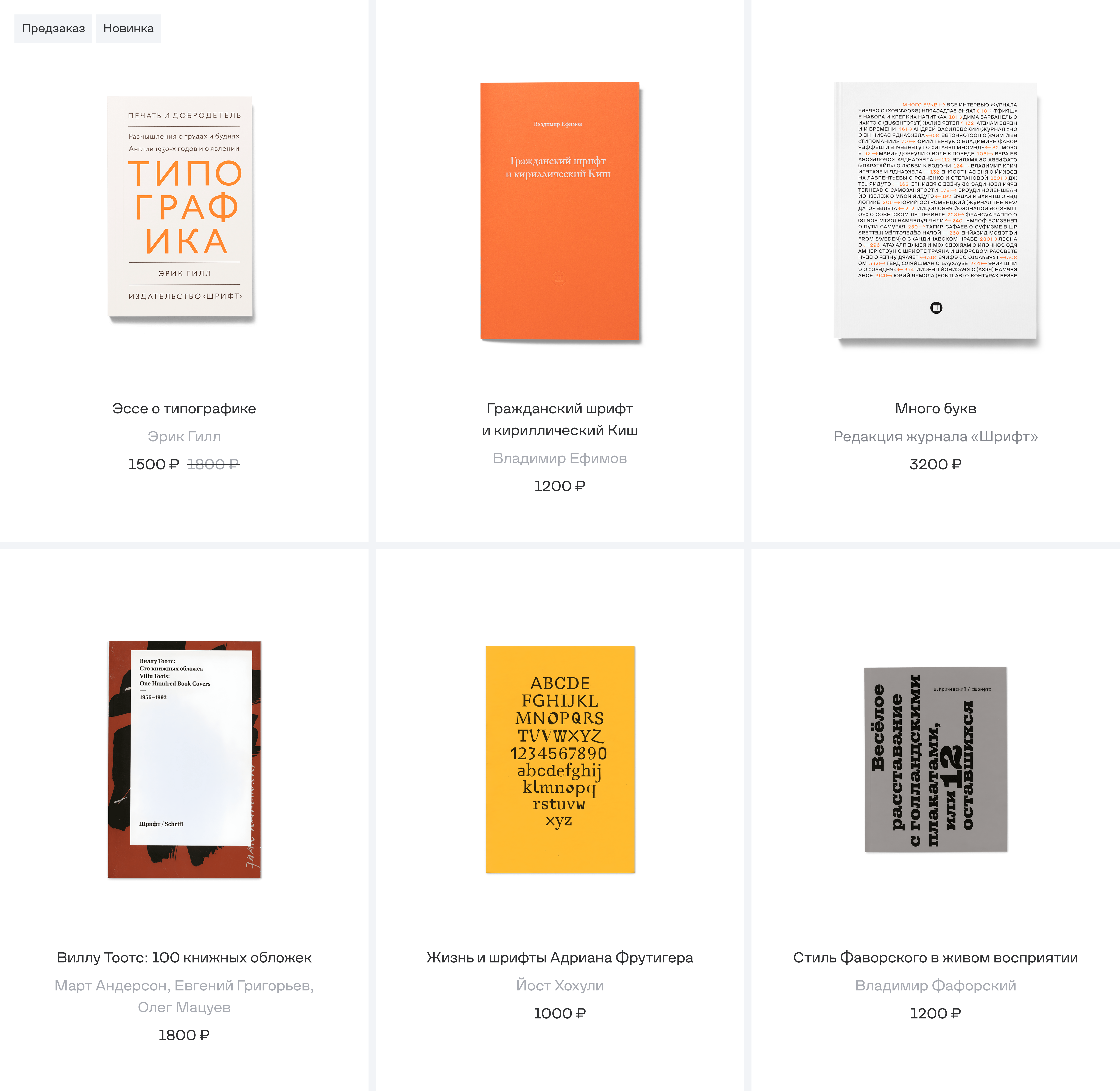
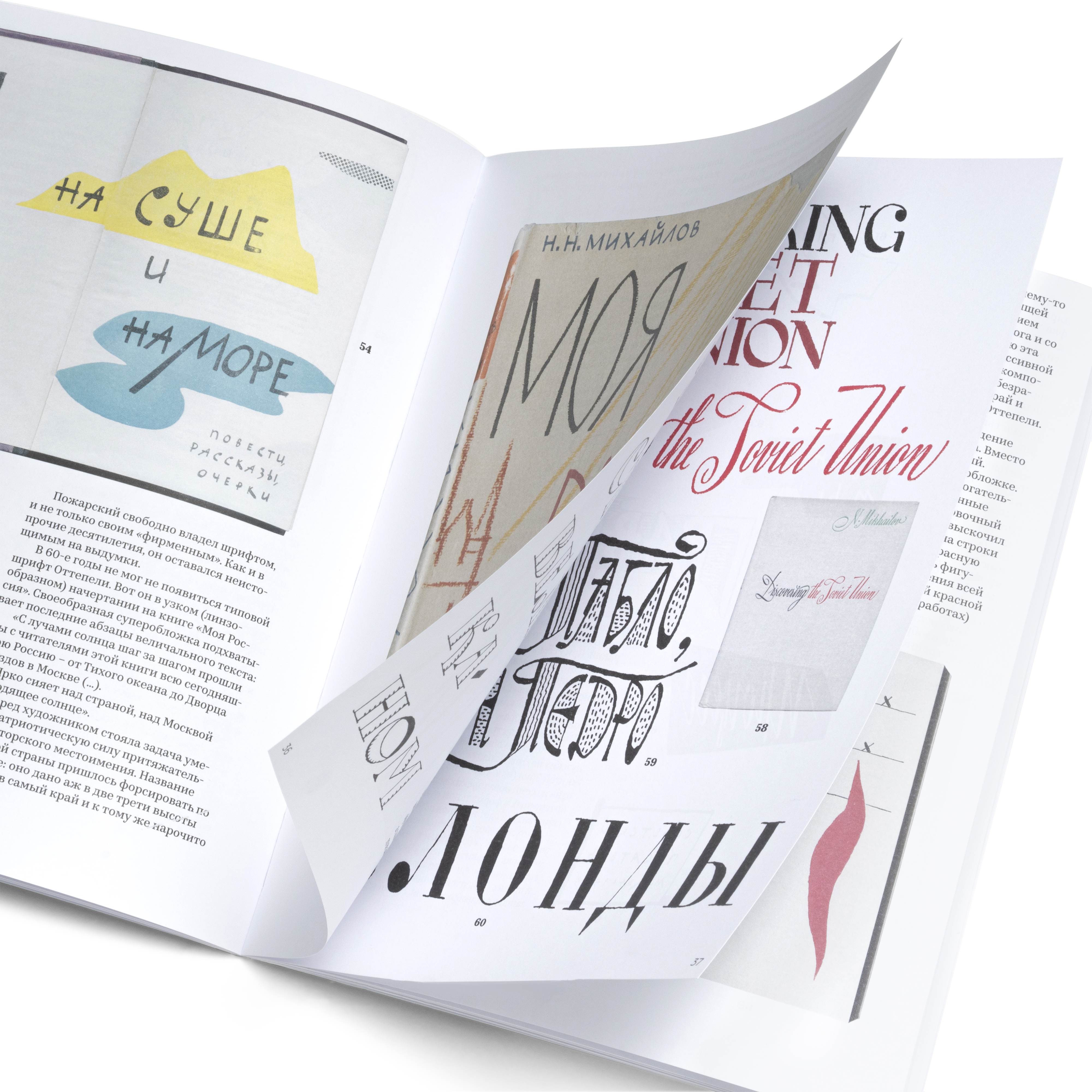
The main material was the publisher’s own work: books, posters, bags, small objects, texts, covers, paper, binding, typography, and the visual language already present in the printed editions. The shop needed to make these things feel desirable without overexplaining them. A book page had to show enough detail to understand the object, while the overall system had to stay calm and easy to navigate.
Photography became a central part of the project. I found and organised a shoot for the publisher’s books, with a focus on macro details: paper texture, edges, binding, print quality, covers, and the small physical signs that make a book feel real. The website and the photographs were created for each other from the start. The images were not added as decoration; they shaped the rhythm of the pages and helped connect the interface to the material world of the publisher.
The other material was product logic. Categories, product cards, checkout, account screens, forms, orders, delivery information, empty states, and responsive behaviour all had to be treated as part of the same design language. A shop like this only feels effortless when the invisible parts are carefully designed.


The system was built around a simple balance: let the objects carry the emotion, and let the interface carry the work. Large images and generous layouts create space for the books and printed matter, while the components stay precise, repeatable, and functional. The design does not try to compete with the products; it frames them, gives them pace, and helps the user move from browsing to buying without breaking the atmosphere.
We designed the site as a full e-commerce product rather than a set of isolated pages. The homepage, catalogue, product pages, cart, checkout, account area, navigation, forms, cards, and service pages were all connected through one design system. This made the shop easier to extend and easier to maintain, while keeping the visual tone consistent across very different types of content.
My role was both designer and organiser. I designed the site and its system, found and organised the book photography, and helped assemble the development side of the project. During production, I stayed close to the build: answering questions, reviewing implementation, checking details, and making sure the finished site kept the same structure, rhythm, and visual intent as the design.


The result is a complete online shop for the physical world of Schrift Publishers: a large, responsive website with a detailed design system, a full e-commerce route, a personal account area, and a photographic language created specifically for the project.
It gives Schrift Shop a clear foundation for selling books, posters, bags, and other objects without reducing them to standard product tiles. The site keeps the publisher’s material culture visible, makes the buying process easier, and creates a system that can grow with new books, new objects, and future parts of the Schrift ecosystem.
Details
Scope
Concept, design, organization
Year
2020–2021
Font used
Struve, Corpus
Team
Art direction
Eugene Yukechev
Photography
M.Y. Room