
Schrift Foundry. A catalogue that lets every typeface speak for itself
A long-term catalogue project for Schrift’s type collection, designed to foreground each typeface and the story behind it — with a website that organises the narrative without stealing attention from the work.
Schrift approaches typography as both art and craft: each typeface carries a visual character, a practical logic, and a story of how it came to be. The catalogue gives those details room to unfold — through small nuances, careful presentation, and the quiet belief that type deserves to be understood, not just displayed.
1. See Schrift Shop case for full picture
Schrift Collective works at the intersection of typographic research, design, writing, publishing, and education. What began as an online journal gradually expanded into a broader practice: designing typefaces, publishing books, building educational programmes, and collaborating with teams across brand identity, visual communication, and multiscript typography.
Over time, typefaces began to accumulate inside the collective. Each member was drawing, testing, and developing fonts alongside other work, and the idea of a foundry became a way to give those projects a public home — a place to tell their stories, sell licences, and support the collective’s continued work around typography.
At the start of the project, Schrift Shop¹ already had a visual language that felt right for the collective. Its design system became the foundation for the new foundry catalogue, opening a three-year process of shaping, extending, and refining the platform. The challenge was not only to build a catalogue for selling fonts, but to create a system where every typeface could be tested, understood, and given its own voice.


Each font needed a different kind of demonstration. Some had to prove themselves in small text, others in large display settings, posters, specimens, or more expressive compositions. The site had to be flexible enough to show the physical qualities of type — its rhythm, texture, scale, and behaviour in use — without turning every release into a separate website.
At the same time, the design system had to stay quiet. It needed to act as a display case: precise, consistent, and supportive, but never louder than the fonts themselves. Behind each typeface were years of research, references, drawing, testing, and personal thinking, so the catalogue also had to make space for process and authorship.
Another layer was the licensing model. Beyond the visual system, the project required a clear structure for licence types and pricing — a fragile balance between legal precision, commercial clarity, and a purchasing experience that would still feel understandable to designers. It had to make the entry point accessible, while encouraging broader use through meaningful discounts for full families and larger licence packages. The goal was to make a complex commercial and legal structure feel understandable, fair, and easy to navigate.
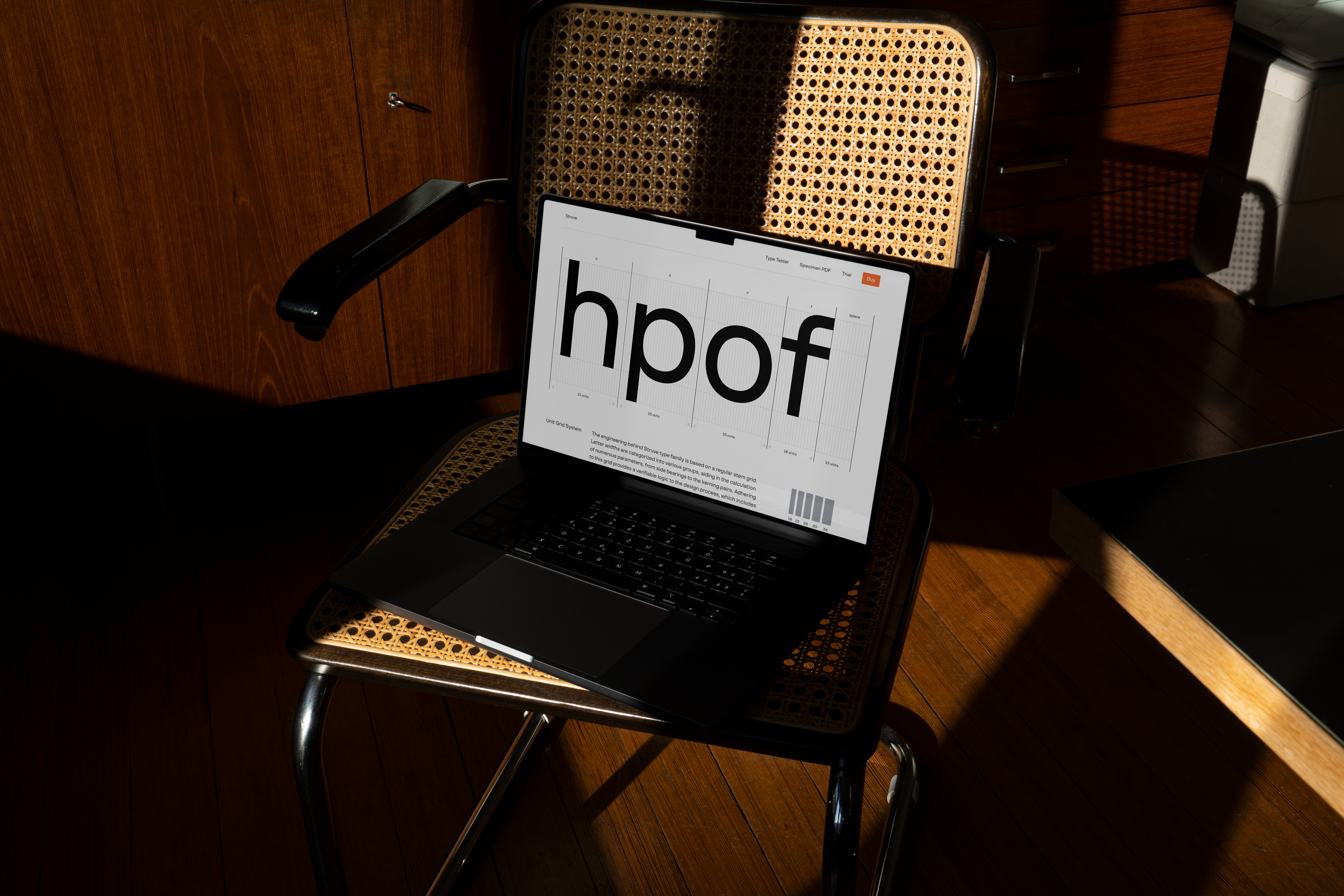
Each typeface also included a type tester, giving visitors a practical way to check language support, try their own text, and see how the family behaves in real typographic settings before choosing a licence.


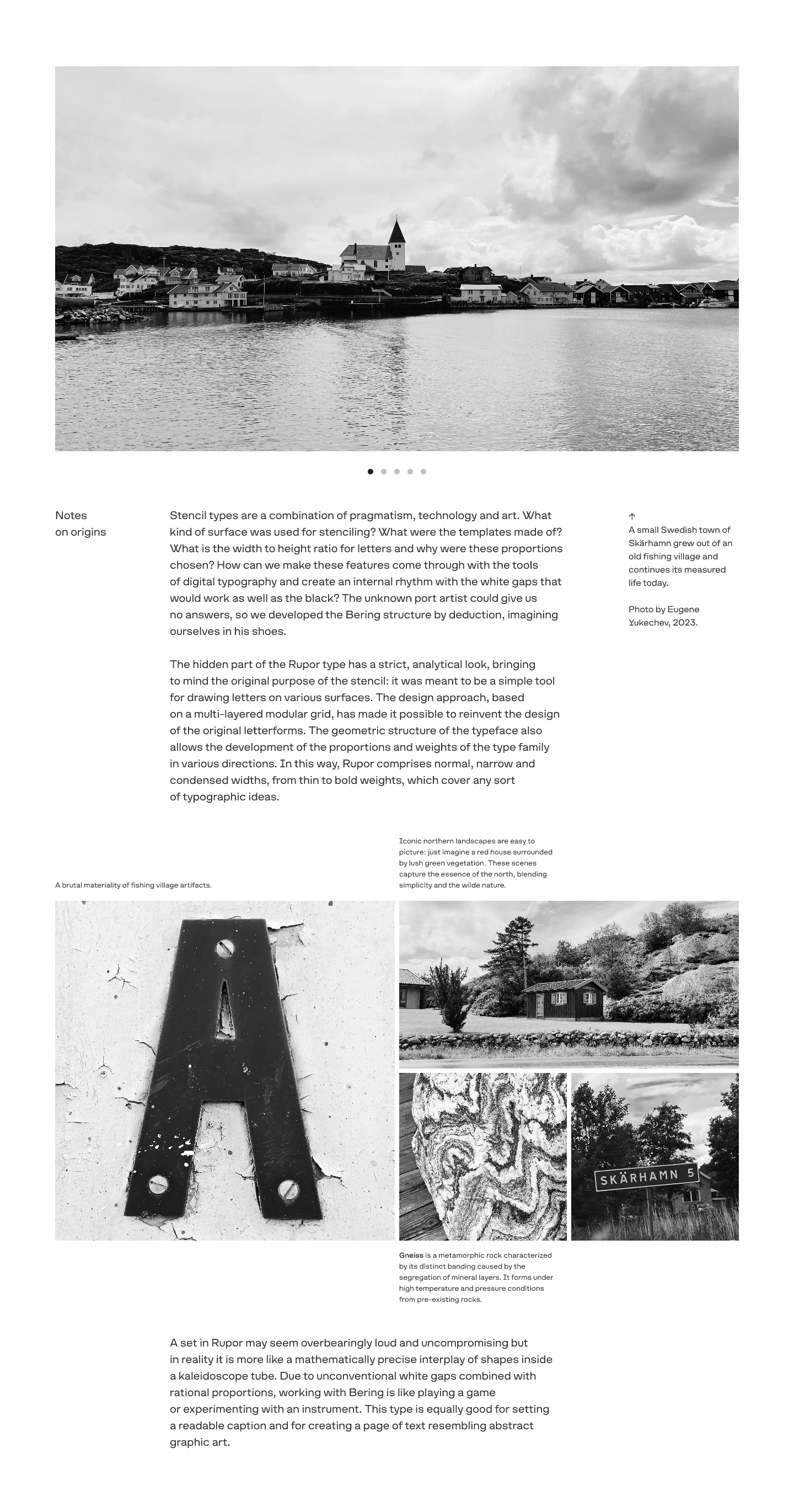

The typefaces themselves were the richest material. A font can generate an endless range of images, from quiet text settings to large-scale graphic compositions, and Schrift already had a growing archive of real-world use: books, exhibitions, bags, printed matter, and other applications where the typefaces had lived outside the screen.
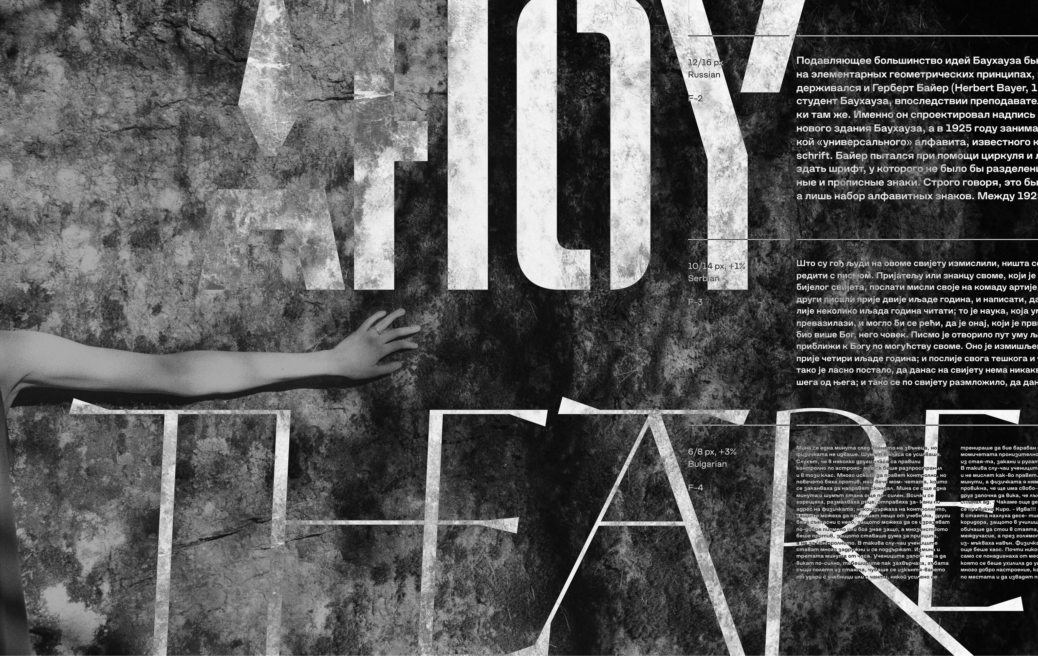
For each family, I also designed a technical specimen — a kind of passport for the typeface. These specimens brought together broad text samples across different languages, sizes, and typographic situations, helping each font show not only its personality, but also its range, reliability, and behaviour in use.


The system was built around a consistent but flexible structure. The homepage opens with a strong visual moment — a 3D animation or a photograph selected by the author to set the tone for each typeface. From there, every type page follows a clear editorial rhythm: a simple cover, sometimes animated for variable fonts; a short description; the family structure; a waterfall of samples; technical details; alternate glyphs; the full character set; the author’s note; production credits; and real examples of the typeface in use.
The structure was never meant to be rigid. Each typeface could shift the emphasis depending on its nature, history, or technical qualities, but the underlying framework kept the catalogue coherent. This made it possible for every project to feel individual while still belonging to the same foundry system.
Schrift Foundry became the result of years of collective work — a shared effort to give the team’s typefaces a public, usable, and commercially sustainable home. Step by step, the project removed the last obstacle between the fonts and their audience: a place where they could be presented, tested, licensed, and understood.
Website marked both an endpoint and a beginning. It completed a long internal journey of research, design, writing, and production, while opening a new life for the typefaces themselves — outside personal folders, internal experiments, and occasional applications, and into a catalogue that can continue to grow.

Details
Scope
Research, concept, design, development
Year
2021–2024
Development
Webflow
Production:
schriftfoundry.com
Team
Consulting
Eugene Yukechev
Assistance
Max Ilinov, Alexey Burmistrov
Photography
Ari Kardashev
Digital sculptures
Oleg Turbaba