
MYBOX. A food app made brighter without becoming louder
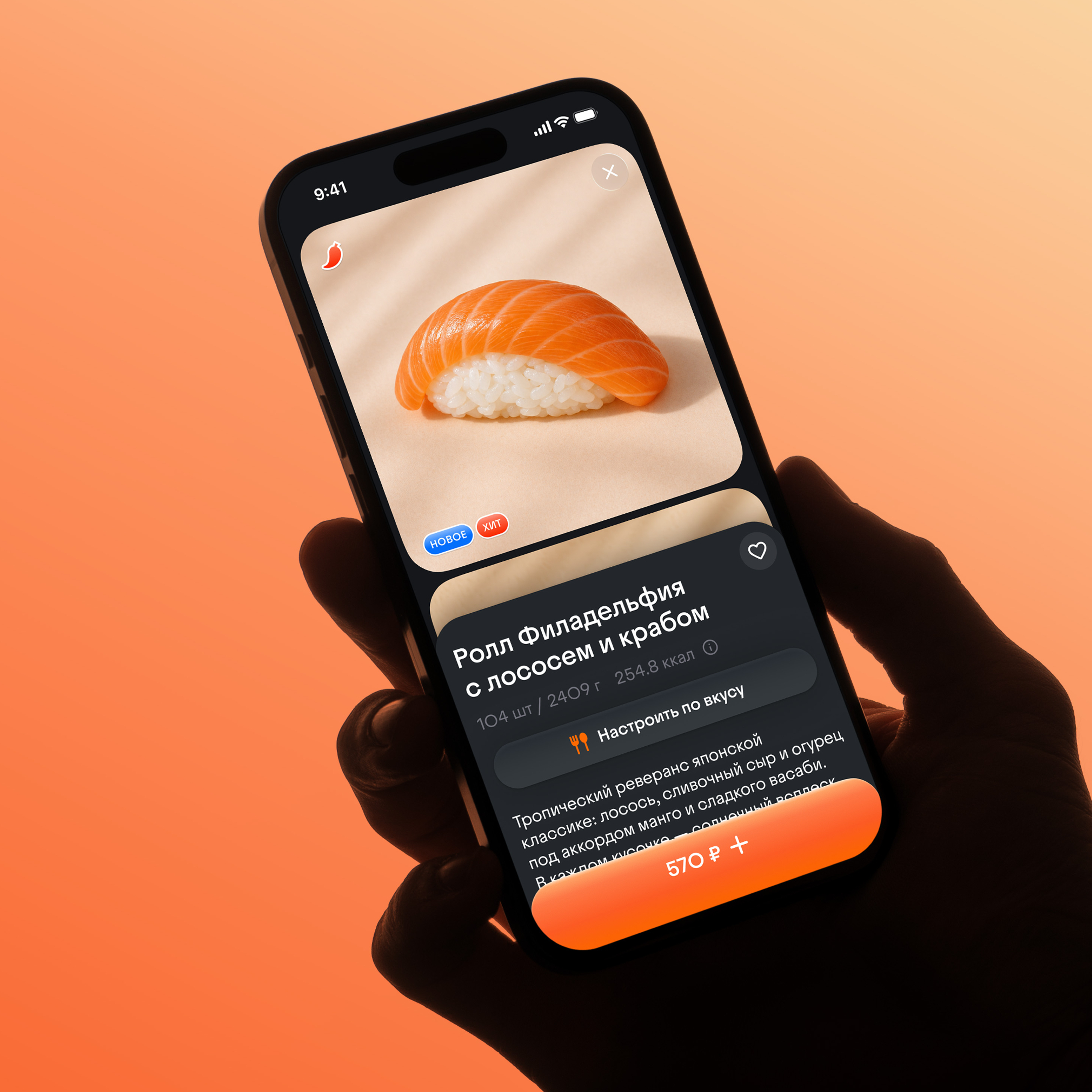
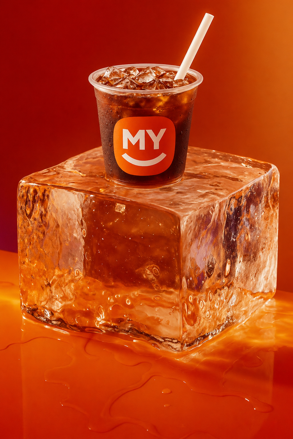
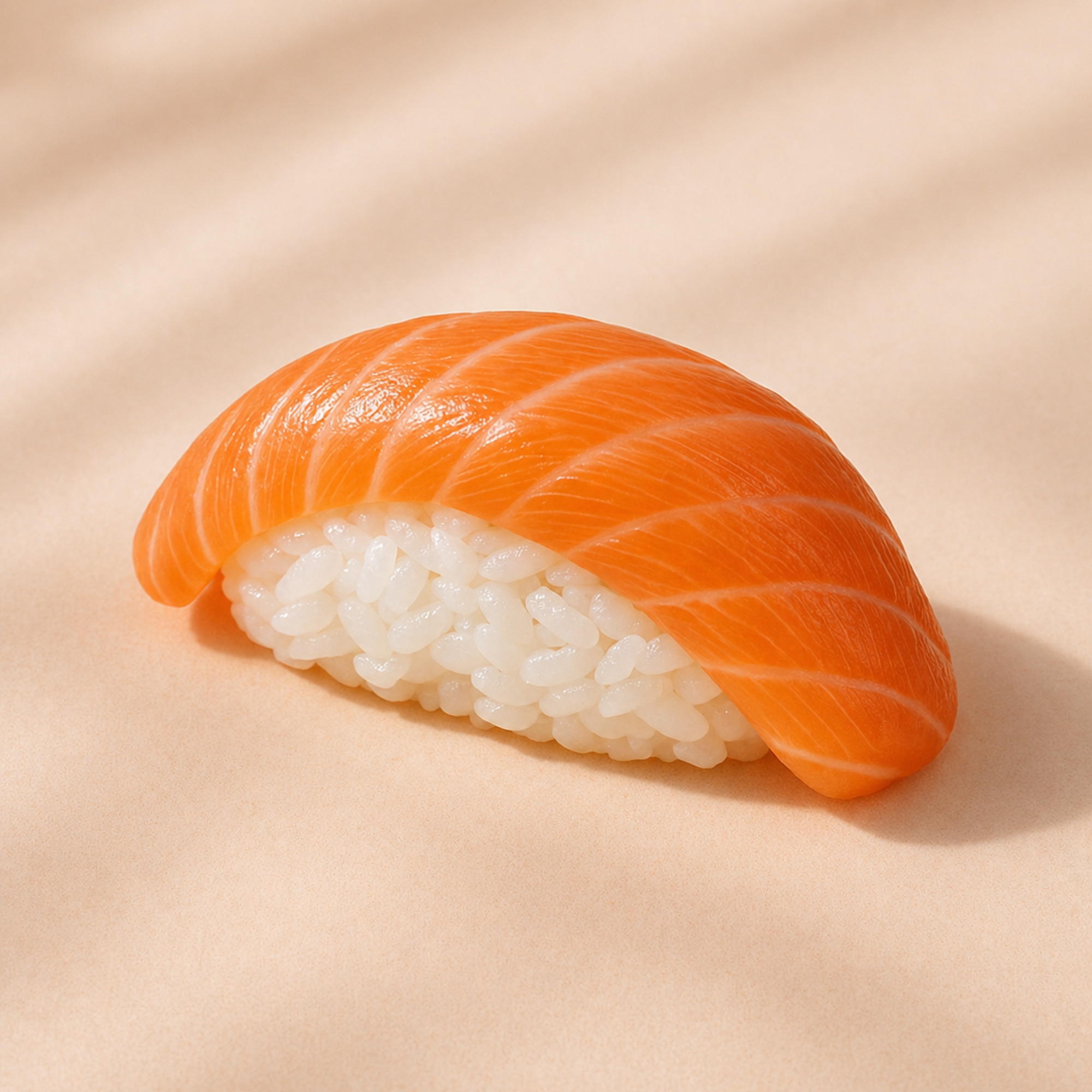
MYBOX needed a new app with more energy, colour, and appetite — something playful enough for the brand, but light enough to stay useful every day. Photography was treated as part of the product language, making the food feel brighter, closer, and more alive.
The work was not only about refreshing the interface. It was about finding a visual and product language for a friendly, slightly rebellious food brand in the middle price segment: bright without becoming heavy, expressive without losing clarity, and memorable enough to stand apart from the delivery apps around it.
The previous product had started to belong to another moment. It no longer carried the MYBOX that existed now: warmer, bolder, and more willing to play. We treated the redesign as a way to give that character a working product system, not just a brighter surface.
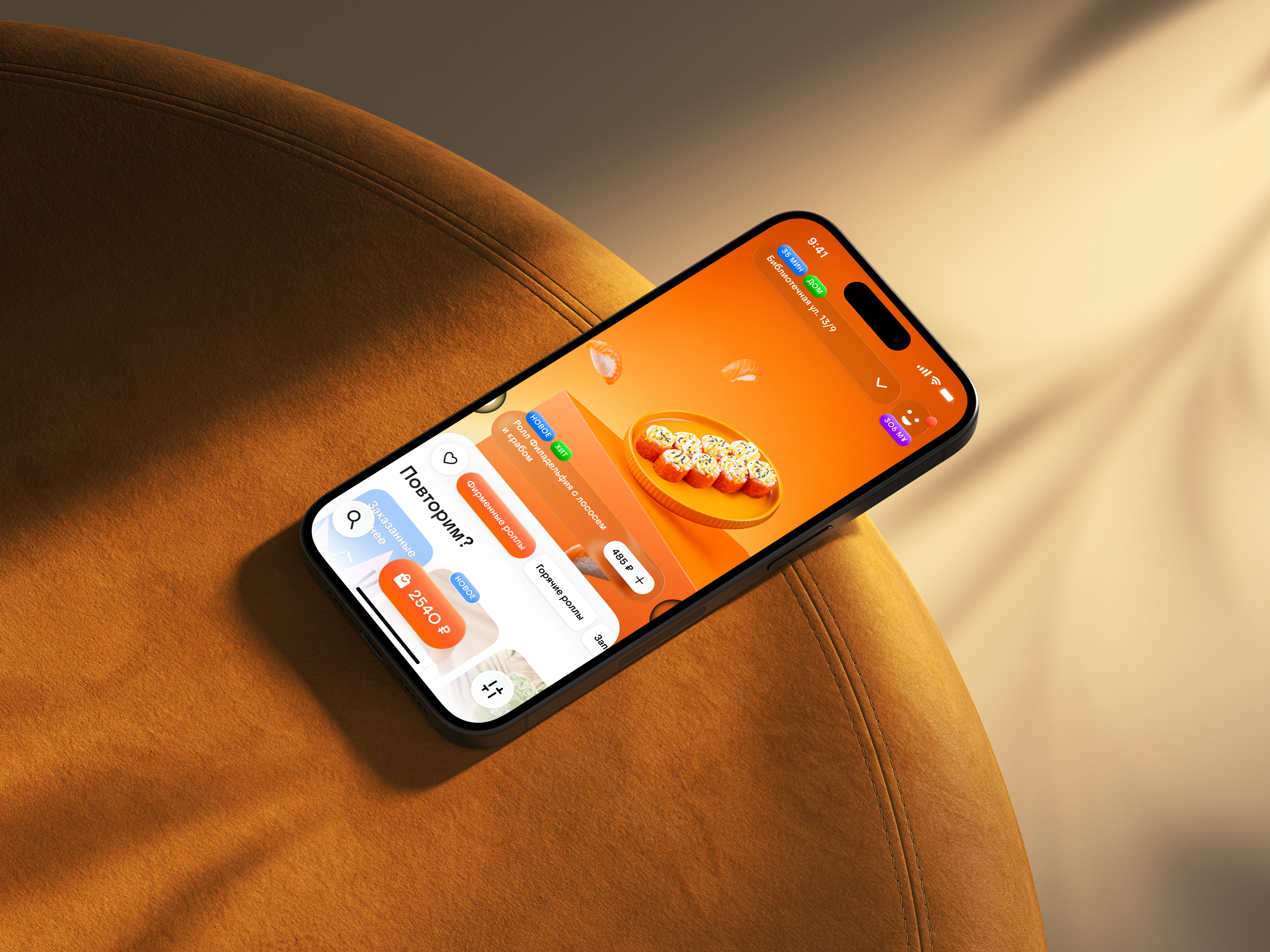
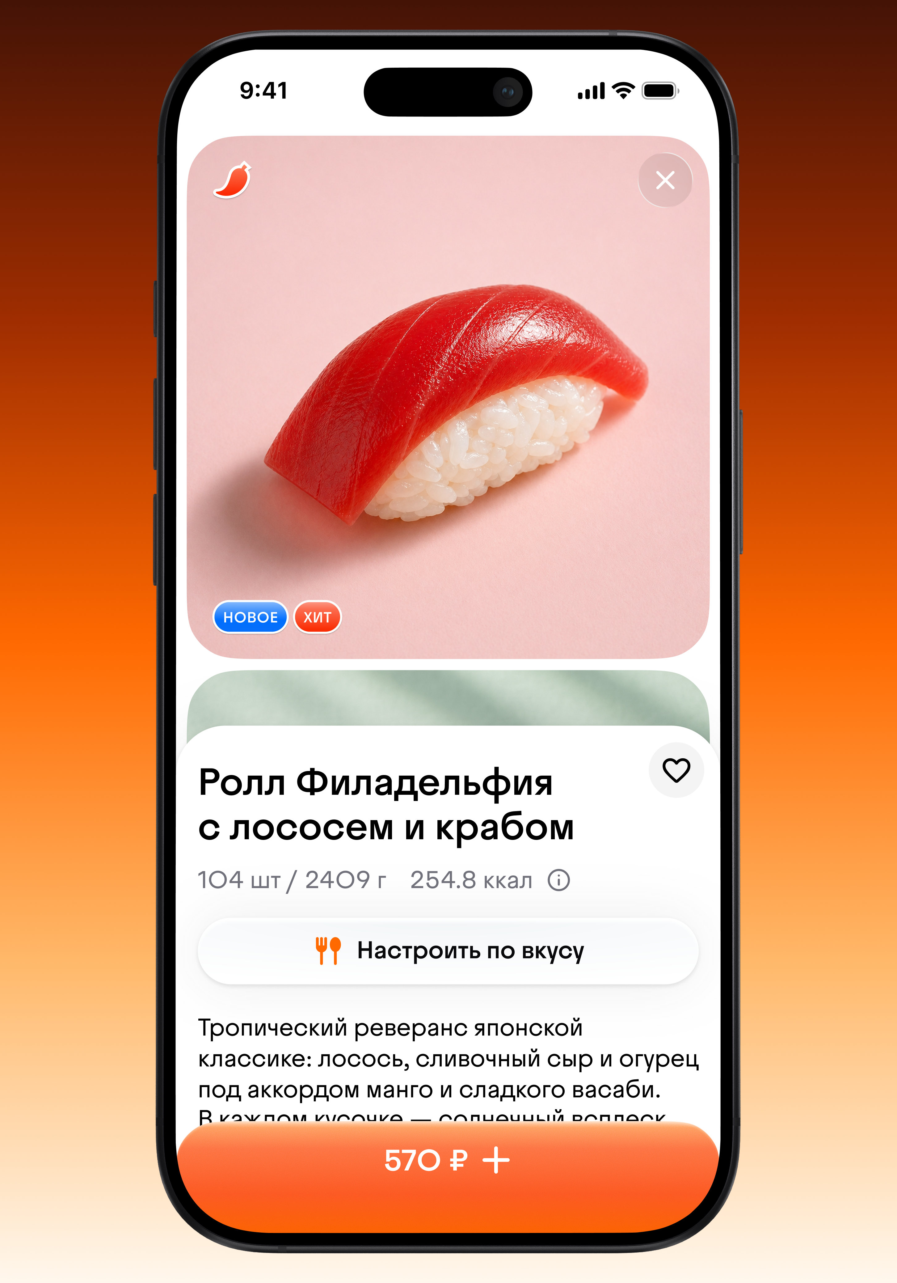
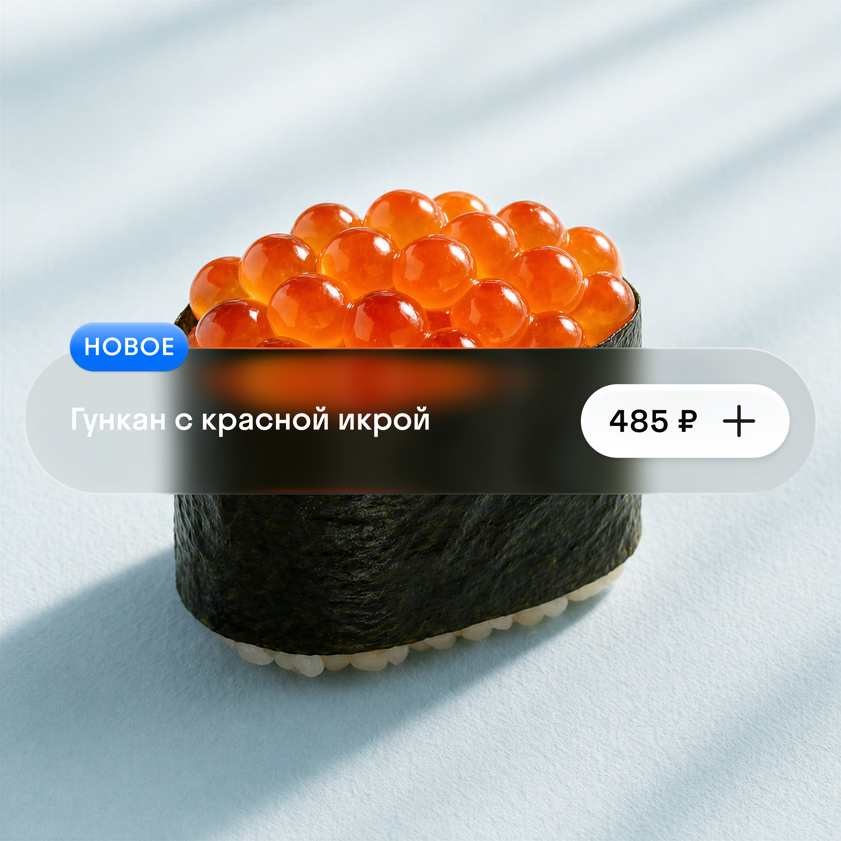
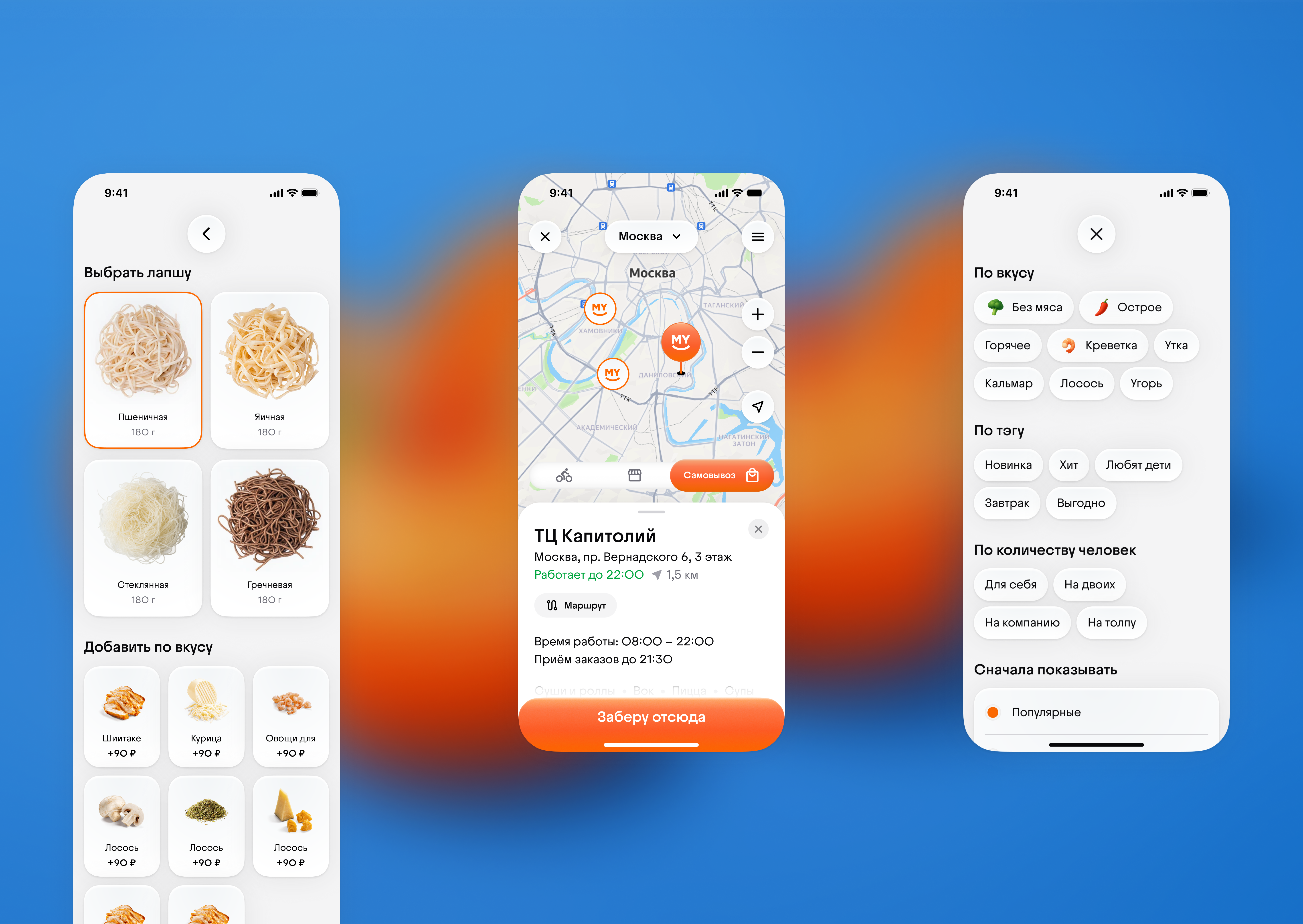
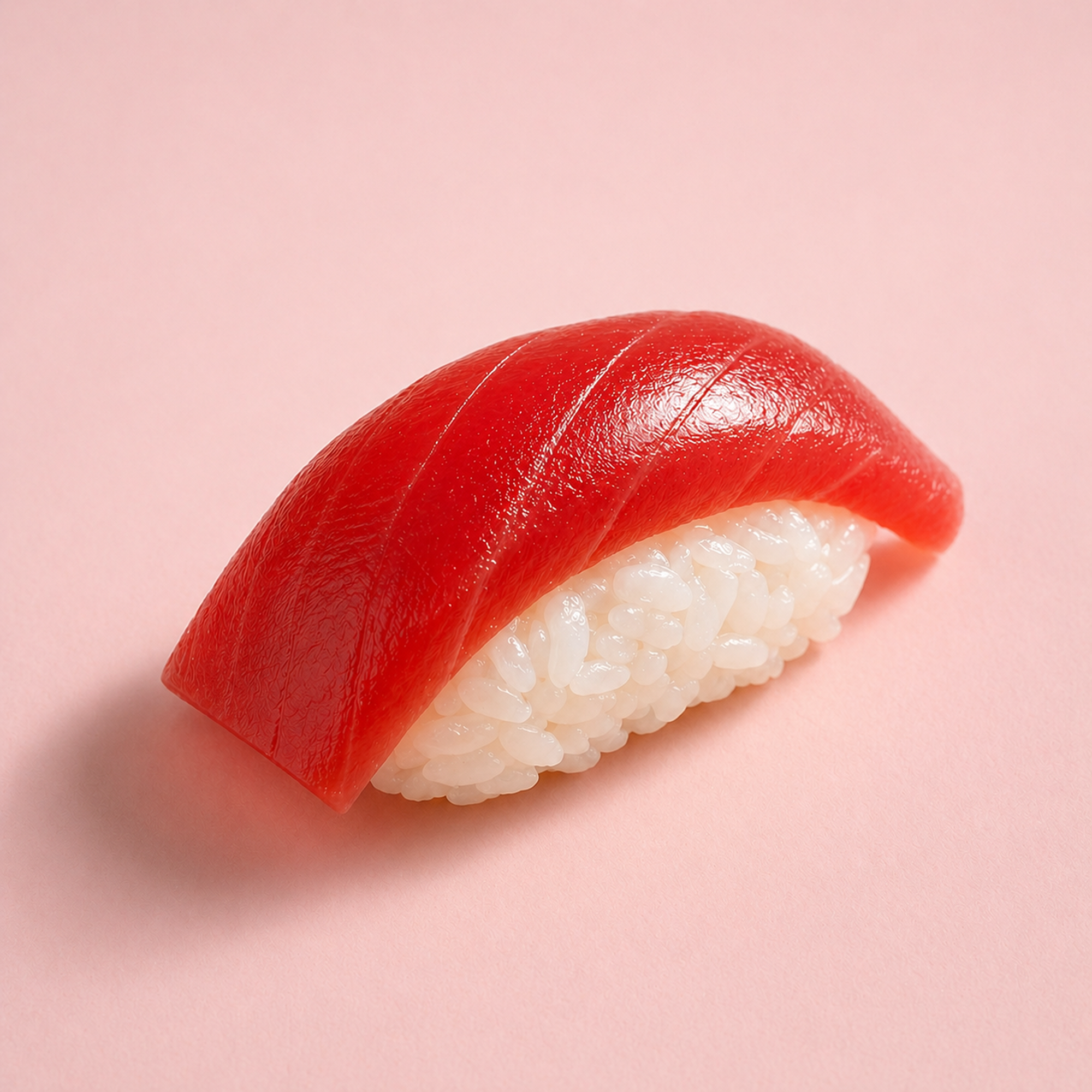
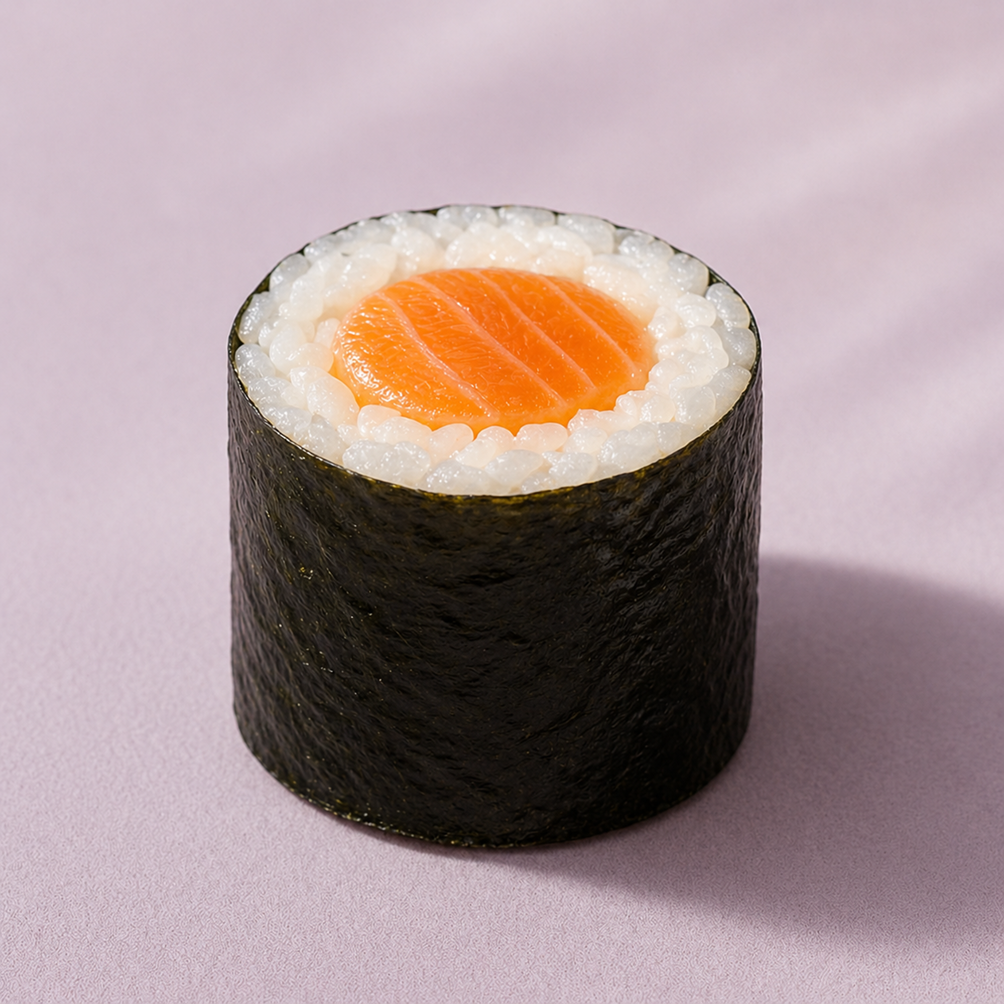
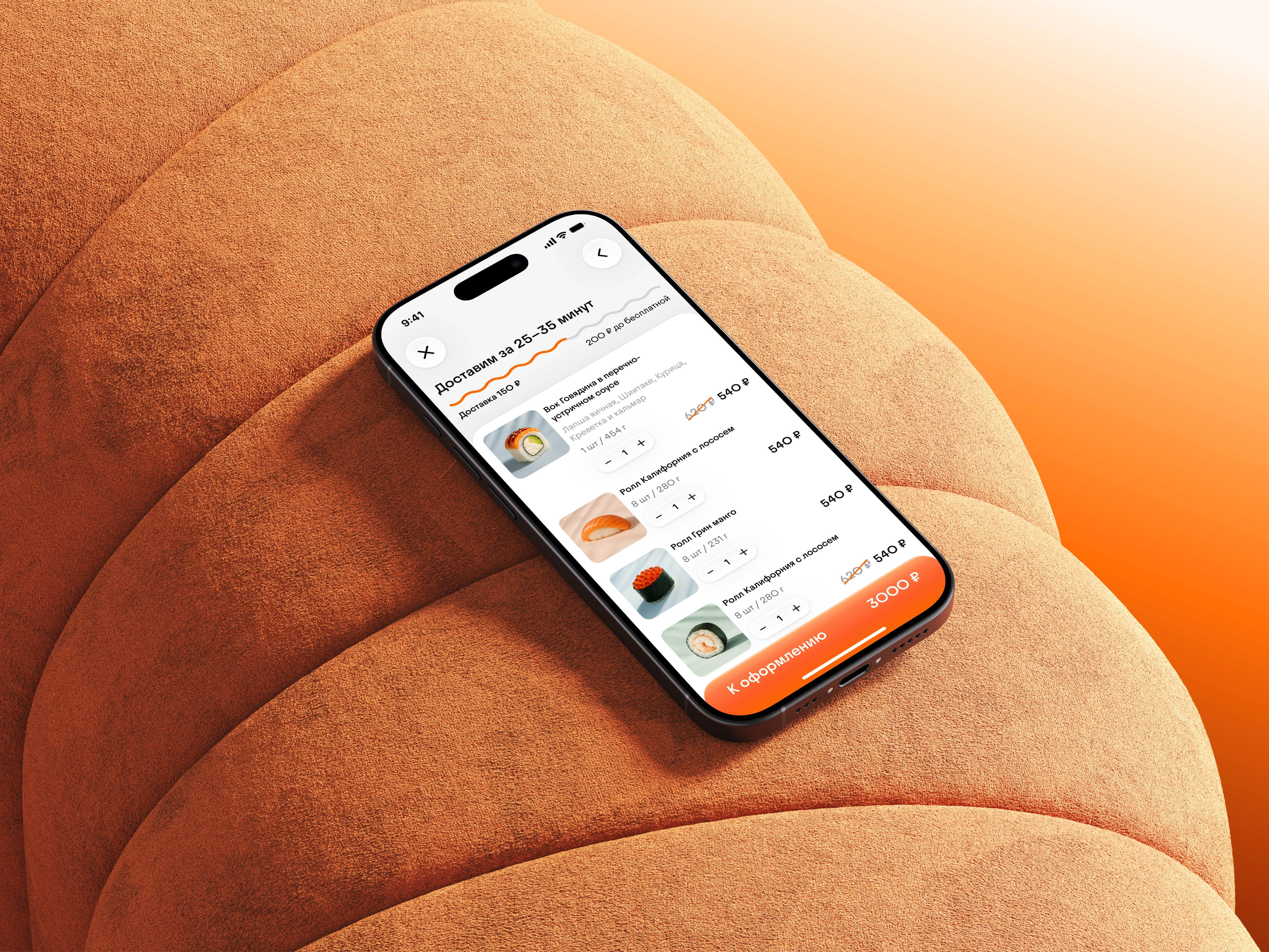
The interface was built around food as the main material. Product cards became larger, images were given more room, and the new photographic direction brought the dishes closer to the screen — soft light, coloured surfaces, visible texture, and a sense of freshness. Around it we designed a base system of components, colours, buttons, states, banners, categories, cart patterns, and delivery moments. Liquid glass, soft volume, white and coloured controls, and even small notification marks were handled as living details, keeping the app tactile without making it heavy.
The result gave MYBOX a broader set of tools for art direction and everyday product work. The brand can now speak through interface, photography, and system behaviour at once — creating an experience that feels distinctive, easy to use, and emotionally closer to the food itself.


Liquid glass, soft volume, white and coloured controls, and even small notification marks were handled as living details


.png)

.png)

.png)


.png)

.png)

.png)

The result gave MYBOX a broader set of tools for art direction and everyday product work. The brand can now speak through interface, photography, and system behaviour at once — creating an experience that feels distinctive, easy to use, and emotionally closer to the food itself.
Details
Scope
Research, concept, design, photo direction
Year
2025
Development
App
Font used
Juneau
Made by mad
Art director
Sergey Galtsev
Designer
Vladimir Pushkarev
Management
Narek Vatinyan, Ilay, Anastasya Nachenkina
MYBOX
Founder
Igor Khen
Art director
Roma
Head of marketing
Inna Goleva
Management
Stanislav Zorkin
Digital sculptures
Oleg Turbaba