Mezhdu Prochim. Creative courses in Russian for children from all over the world
A creative school can be more than a place to learn a skill. For children growing up in different countries, it can become a meeting point — a space where language, imagination, and shared interests help them feel part of the same world.
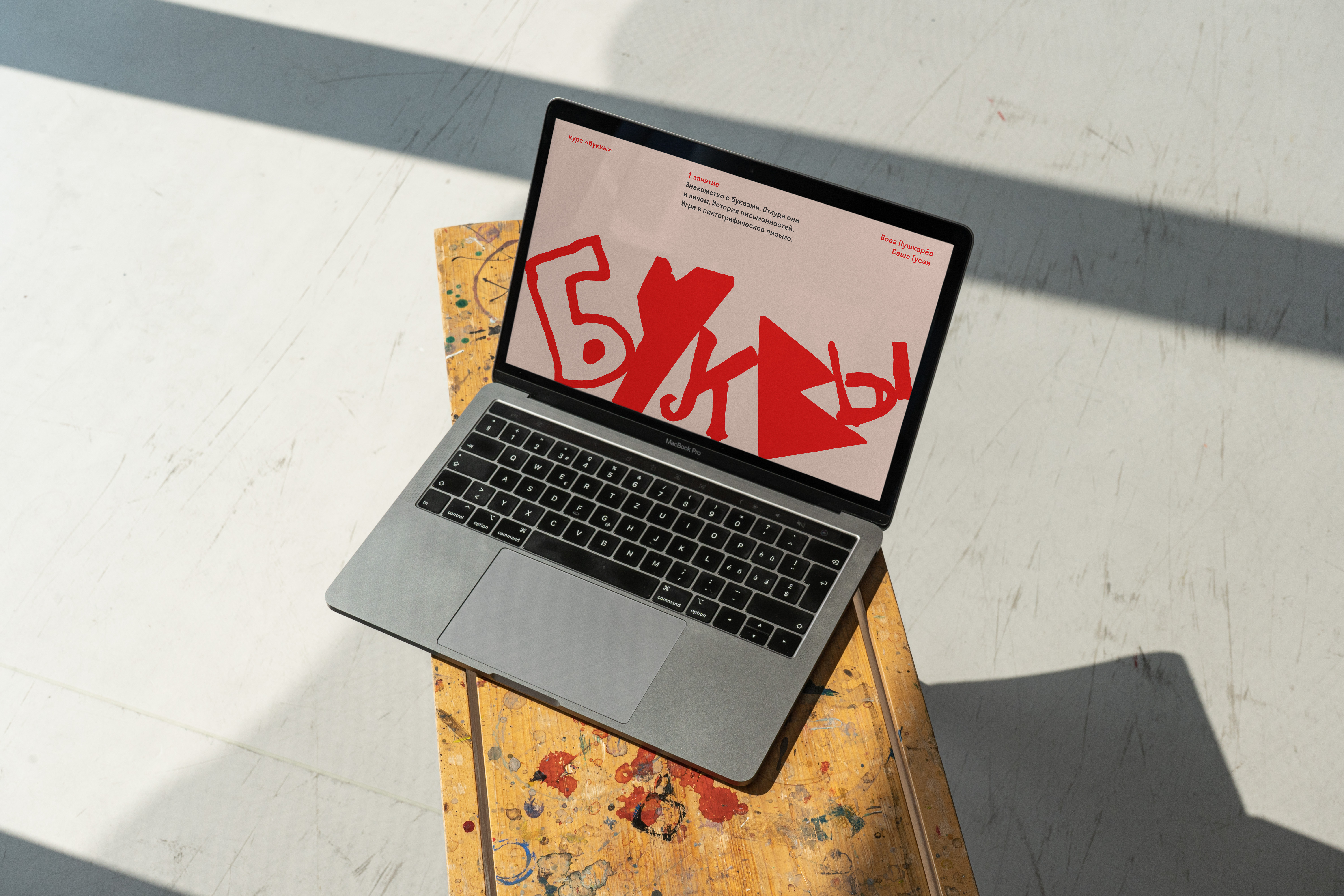
For Mezhdu Prochim, this idea was built into the visual language itself. The project did not need a polished adult imitation of childhood; it needed something made from real children’s imagination. That material became the alphabet: large letters drawn by children, scanned, vectorised, and turned into the main visual voice of the project.
Mezhdu Prochim is a creative education project for Russian-speaking children around the world. It began with online courses in storytelling and animation for children aged 8–12, and later expanded into design, mnemonics, theatre, podcasts, camps, and other creative formats. After the project was paused in summer 2022, its founder Sasha Gusev returned to it with a clearer sense of purpose: to create a place where children from Georgia, Serbia, Germany, the US, and many other countries could meet, learn together, and do things they were genuinely interested in.
The original identity and website were created by Non-objective. I joined the project later, when Sasha needed ongoing design support — to maintain the existing system, develop new materials, and help Mezhdu Prochim grow across the website, Instagram, courses, projects, camps, and special formats.


The challenge was not to redesign Mezhdu Prochim from scratch, but to continue developing its visual language without losing the charm and looseness of the original idea. At first, I worked closely within the existing guidelines, supporting the project with new covers, posts, pages, and course materials.
Over time, the system became more experimental. We started testing new colour combinations, building bolder compositions, and stretching the identity into more expressive forms. The design had to stay friendly and recognisable, but also flexible enough to hold many different subjects — from animation and photography to theatre, design, memory techniques, and playful experiments with letters.


The main visual material of the project was a growing archive of large letters drawn by children. We scanned them, vectorised them, and used them across course covers, Instagram posts, website graphics, announcements, worksheets, and typographic compositions. Almost every project or post could turn into a mountain of letters that slowly gathered into a title.
The strictest rule was simple: never invent the shapes. Every letter had to come from a child’s drawing. We could clean it, prepare it, compose it, and build layouts around it, but the form itself had to stay real. This rule gave the project its character: expressive, imperfect, handmade, and impossible to fake.


I treated the identity as a living system that could keep growing through use. Instead of making each course or announcement look completely new, we built variation from the same core ingredients: children’s letters, bold colour, simple layouts, and a tone that felt open, warm, and inventive.
Mezhdu Prochim brought together specialists from many creative fields — animators, photographers, designers, theatre practitioners, artists — so the design had to support very different formats without becoming too neutral. I also created my own course for the project, simply called Letters, where I introduced children to the history of writing systems, the development of Cyrillic, and the idea that letters can be explored, drawn, broken, rebuilt, and imagined again.
The result was an evolving visual system for a project that never wanted to feel like a conventional online school. Mezhdu Prochim became a place where courses, posts, covers, worksheets, camps, and experiments could all speak in the same voice — curious, handmade, and full of character.
The children’s letters gave the project something no stock illustration or polished identity could imitate: a visual language made from the same imagination the courses were trying to support. For a project built around children meeting, learning, and creating together, that felt like the right foundation.

Details
Scope
Design, Instagram, Course
Year
2021–2025
Development
ReadyMag, Webflow
Font used
Proto Grotesk, Stratos
Team
Founder
Sasha Gusev
Design
Vladimir Pushkarev
Identity
Non-objective