
Made by Mad. From brand expression to a working digital system
Made by Mad’s new identity marked a shift in how the studio could present itself: more distinctive, more expressive, and more closely aligned with the kind of digital products it creates. The website became the place to translate that shift into a working experience — turning colour, typography, illustration, and tone into a flexible interface system for services, cases, communication, and growth.
Made by Mad is a full-cycle digital studio working across research, design, development, launch and product support. Its own website had to reflect that breadth: not only presenting the studio’s personality, but also making its process, capabilities and work easier to understand for potential clients.
The new brand identity by Maksim Arbuzov gave the studio a distinctive visual foundation. It introduced a bold colour palette, a set of illustrations, a display typeface and a monospaced typeface. The next step was to bring this identity into the studio’s primary digital touchpoint and make it work across real interface needs — from expressive landing sections to service descriptions, project previews, navigation and contact scenarios.


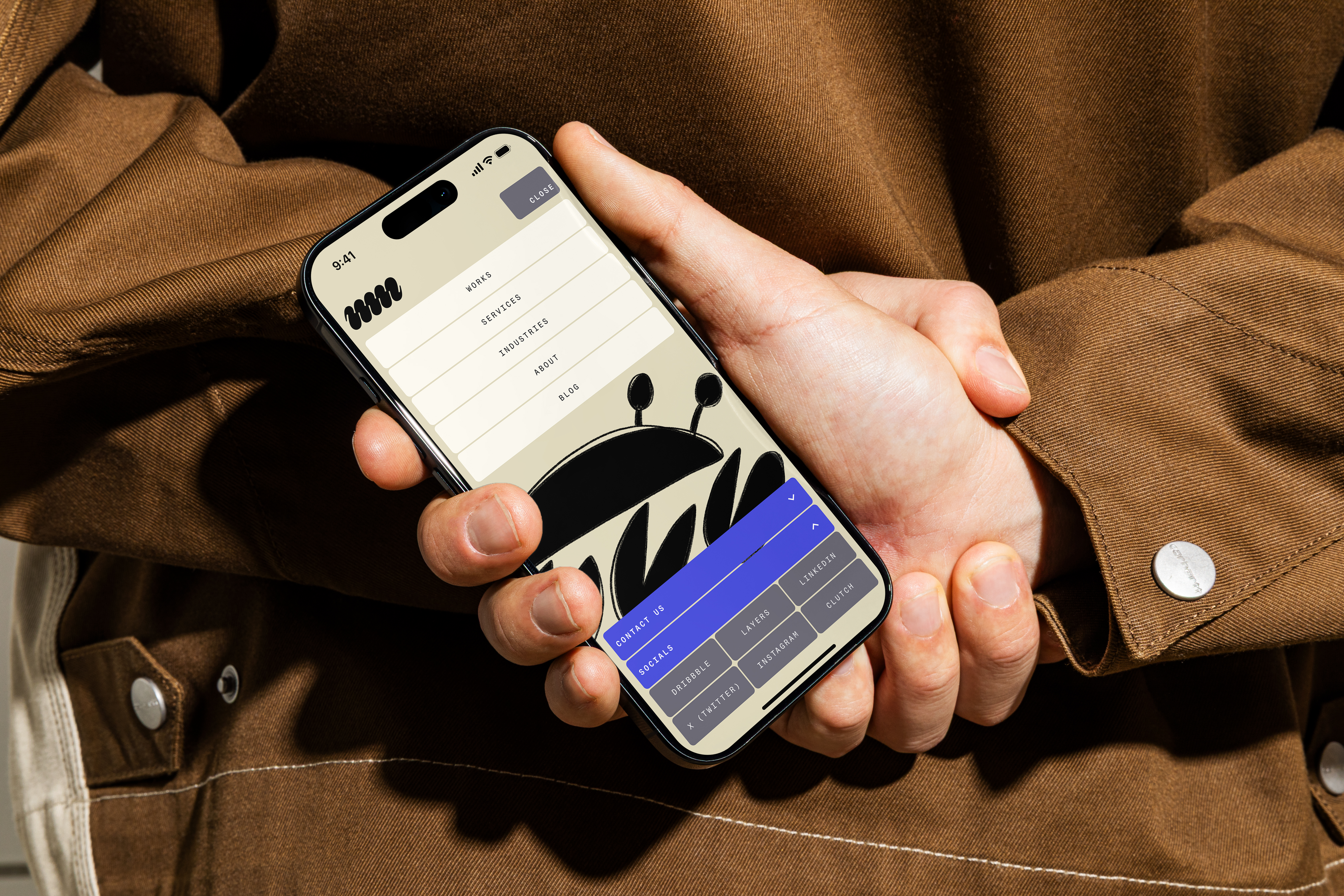
The final design translated Made by Mad’s rebrand into a working digital foundation. The website system gave the identity a practical interface layer, with reusable components, typographic rules, expanded colour logic and clear content structures.
This made the studio’s digital presence more coherent and scalable. The new website could express the brand’s energy while supporting the practical needs of a full-cycle product studio: explaining what the team does, showing how it works, presenting cases and guiding new clients towards a conversation.
Details
Scope
Concept, design
Year
2026
Font used
Mad
Algorytm
Team
Art direction
Sergey Galtsev
Brand identity
Maksim Arbuzov
Illustrations
Katerina Bielobrova