
Humans. A brighter layer for daily life
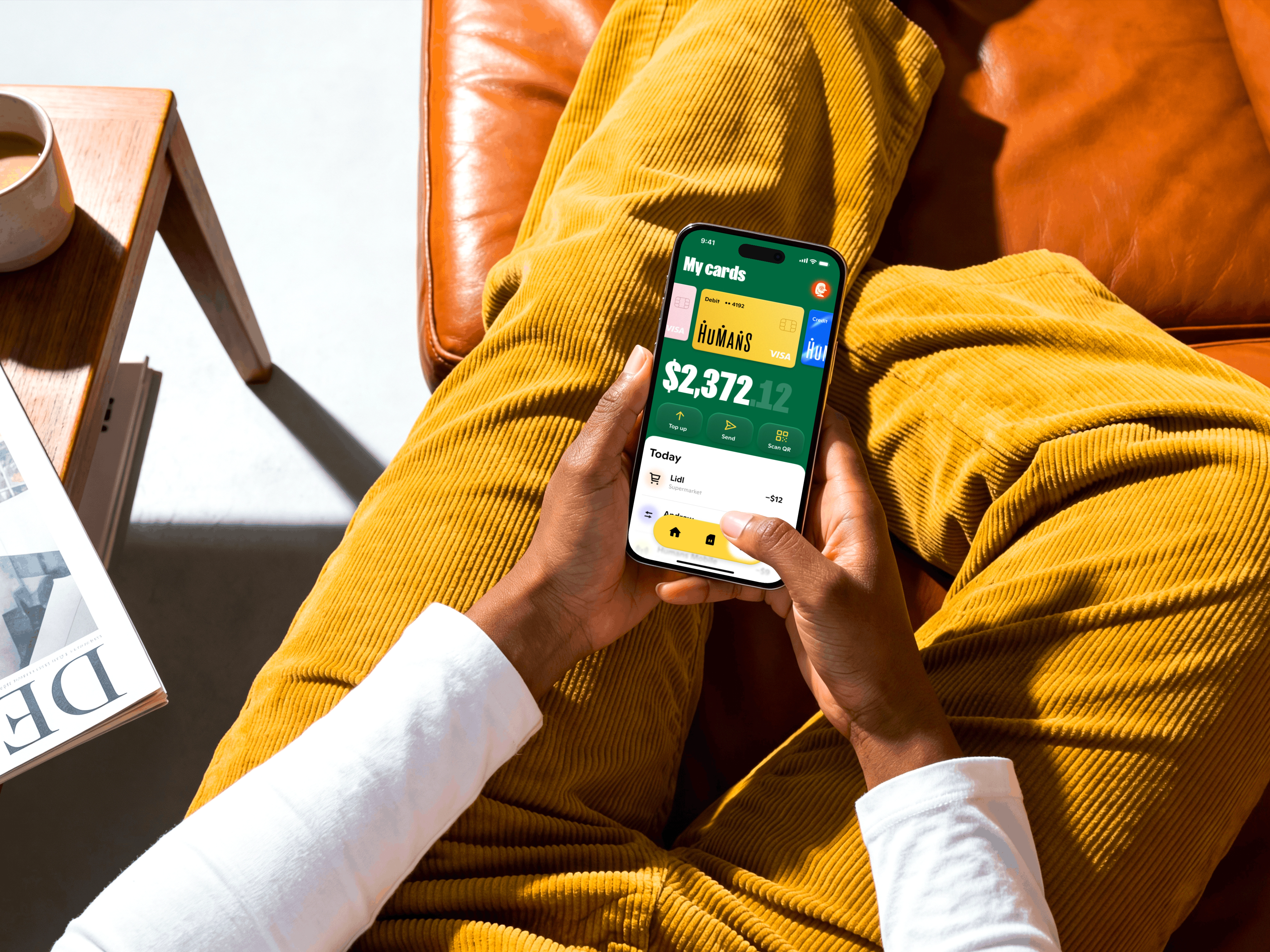
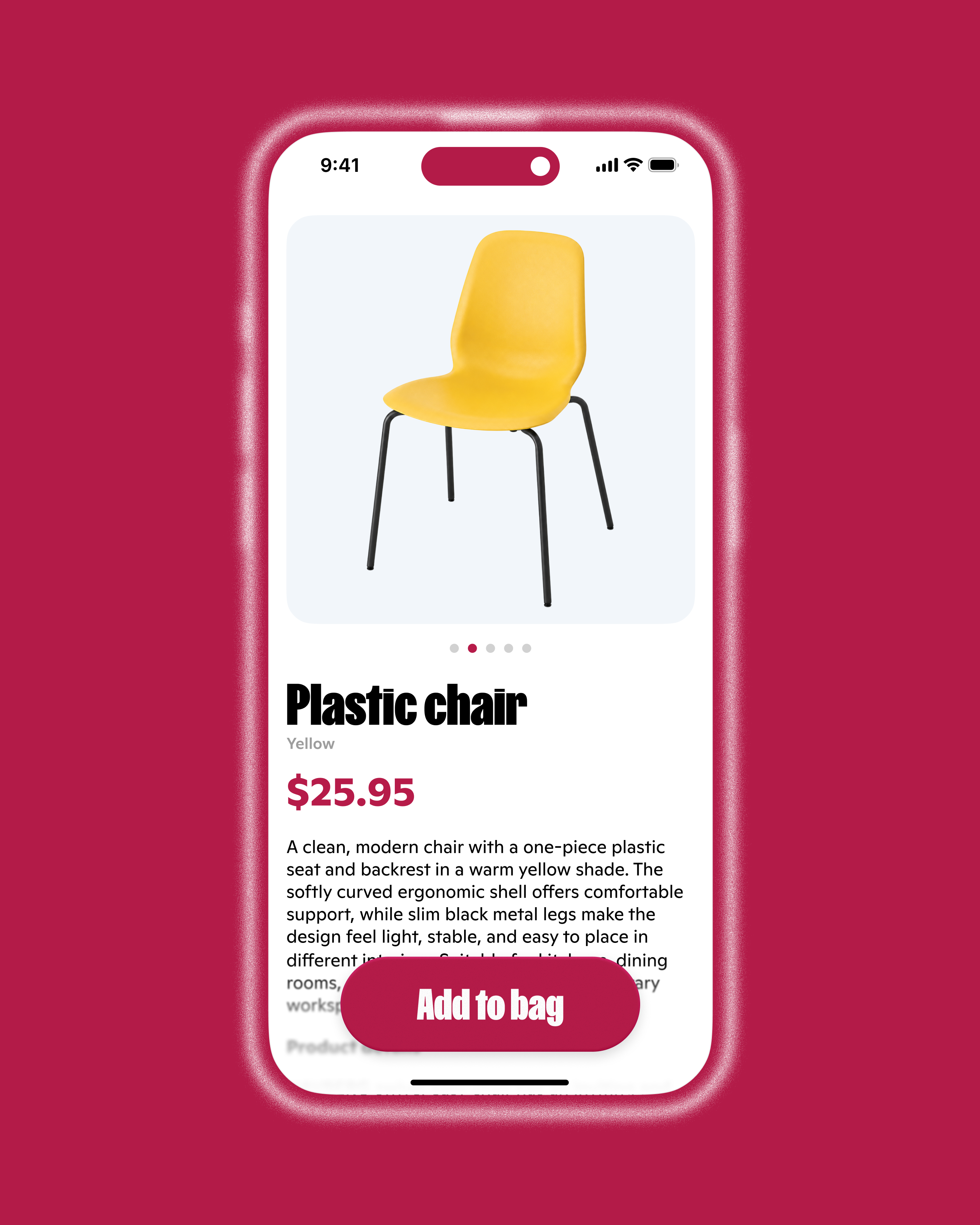
Humans is a mobile operator, banking service and marketplace brought together in one digital product. I worked on a new product concept across the mobile app and website, and also designed a set of category icons to help the system feel clearer, more recognisable and more alive.
Humans combines several daily services in one ecosystem: mobile connection, banking tools and a marketplace. This makes the product useful, but also complex. Every part has its own logic, rhythm and expectations, from checking a mobile balance to browsing offers or managing money.
The task was to create a new concept for how this product could look and feel across its main surfaces: the mobile application, the website and a set of category icons.

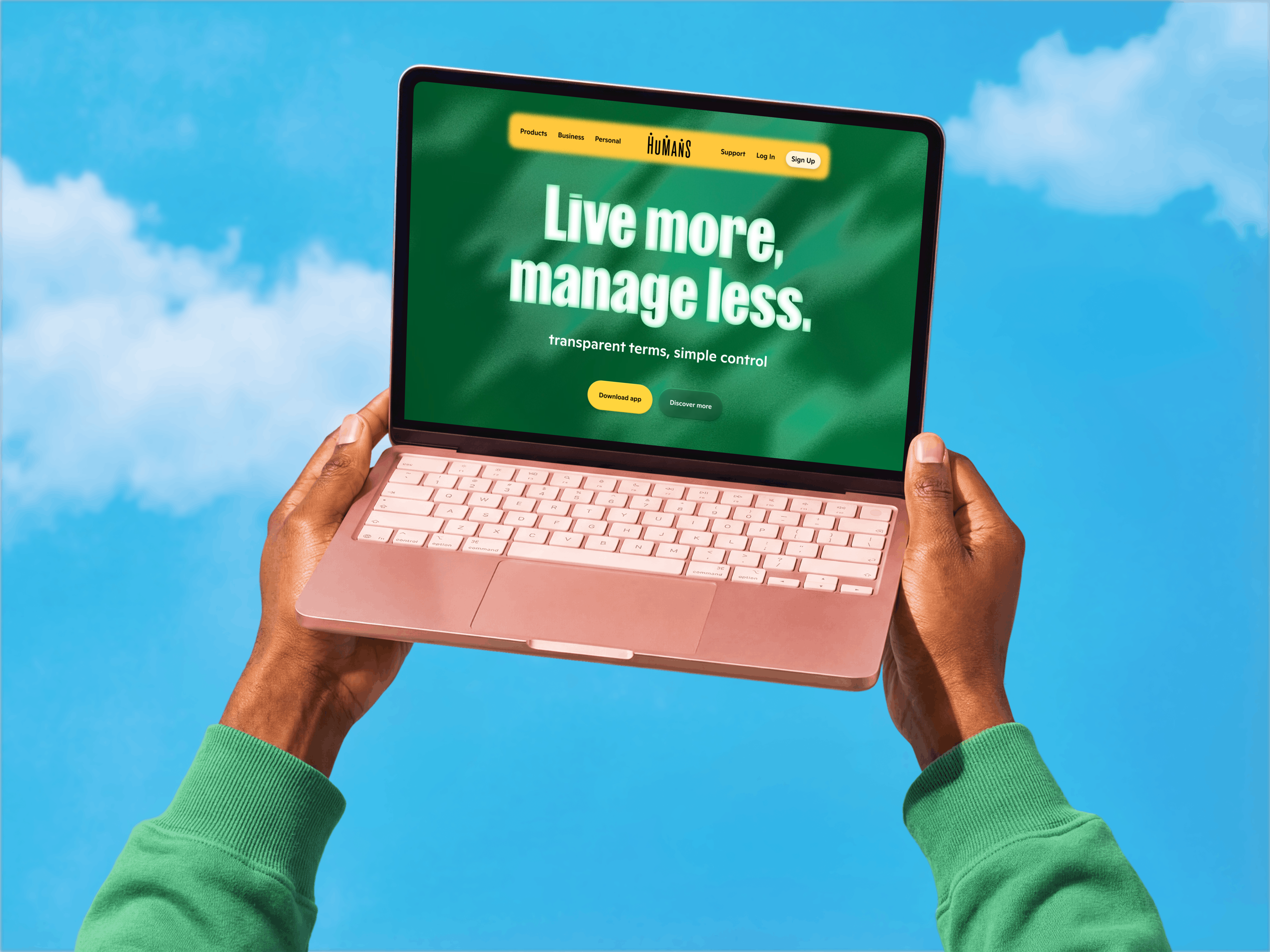


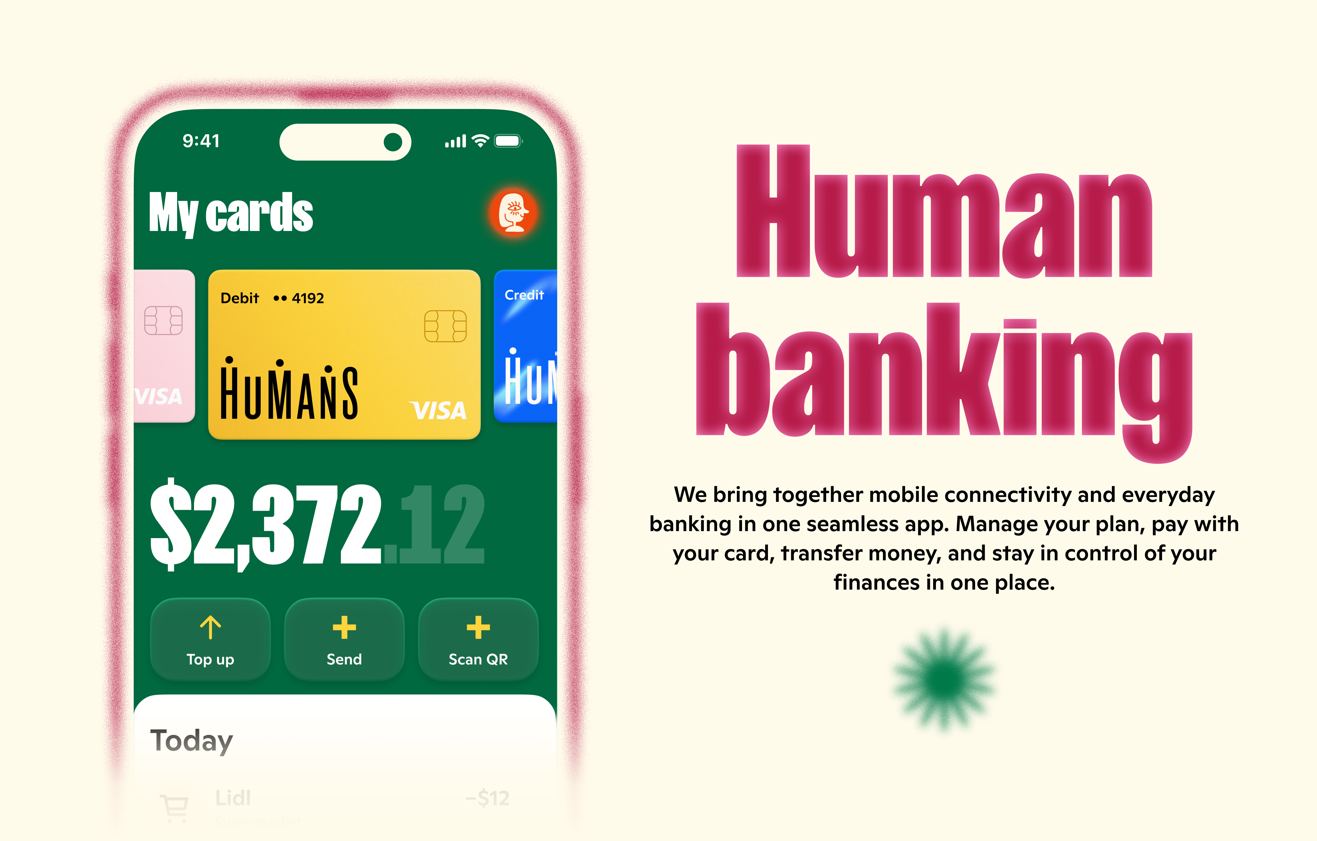


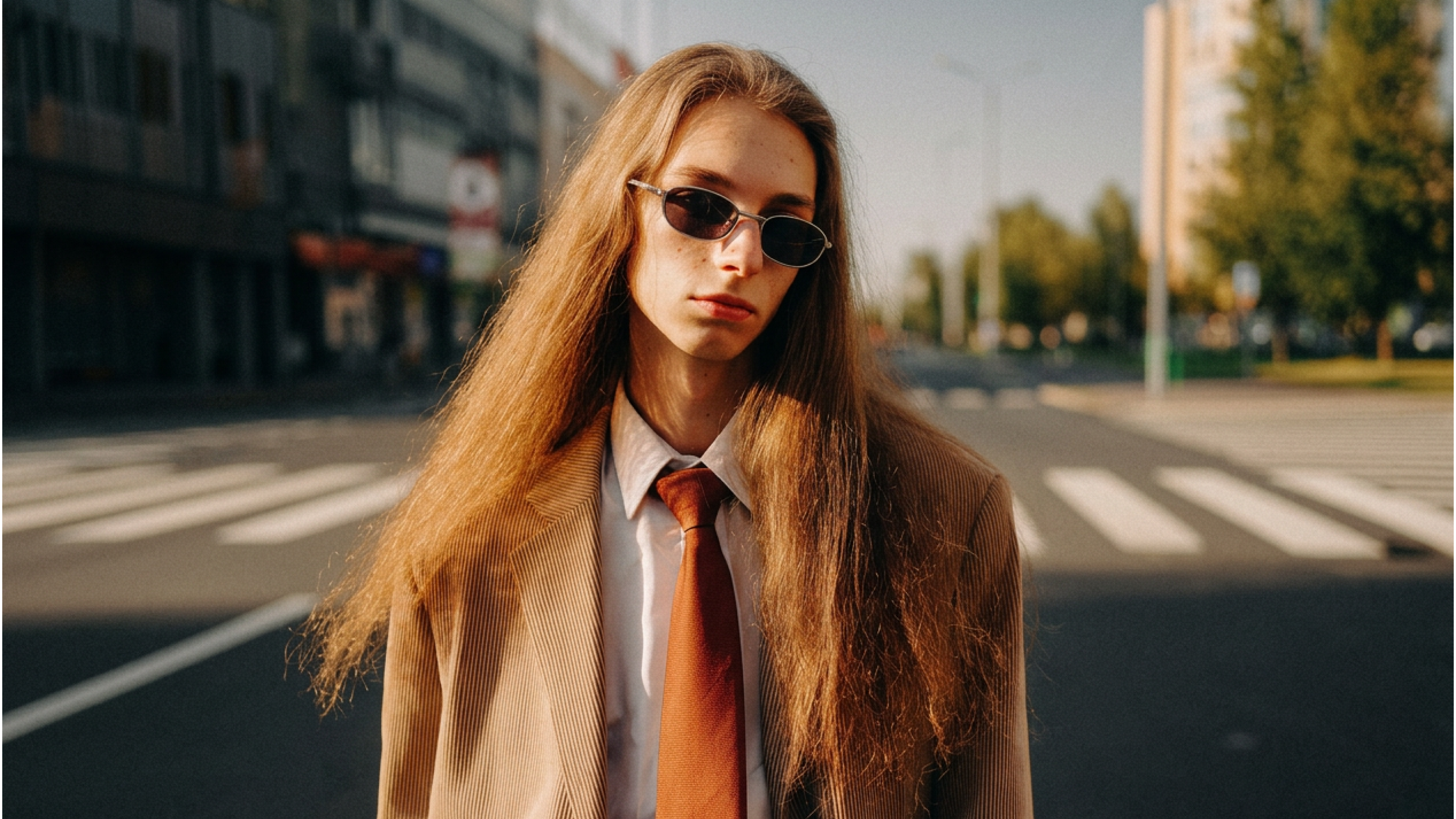

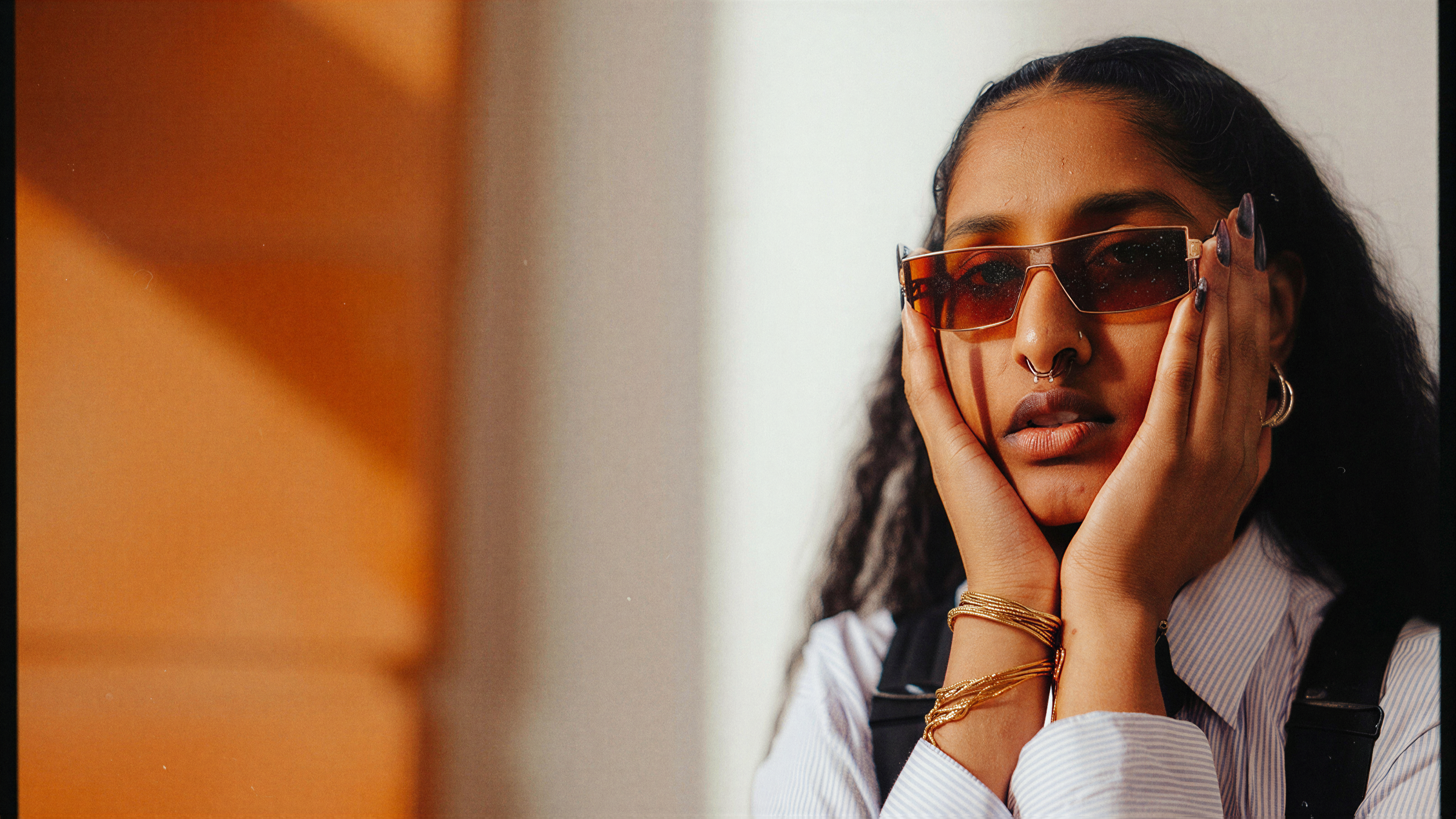

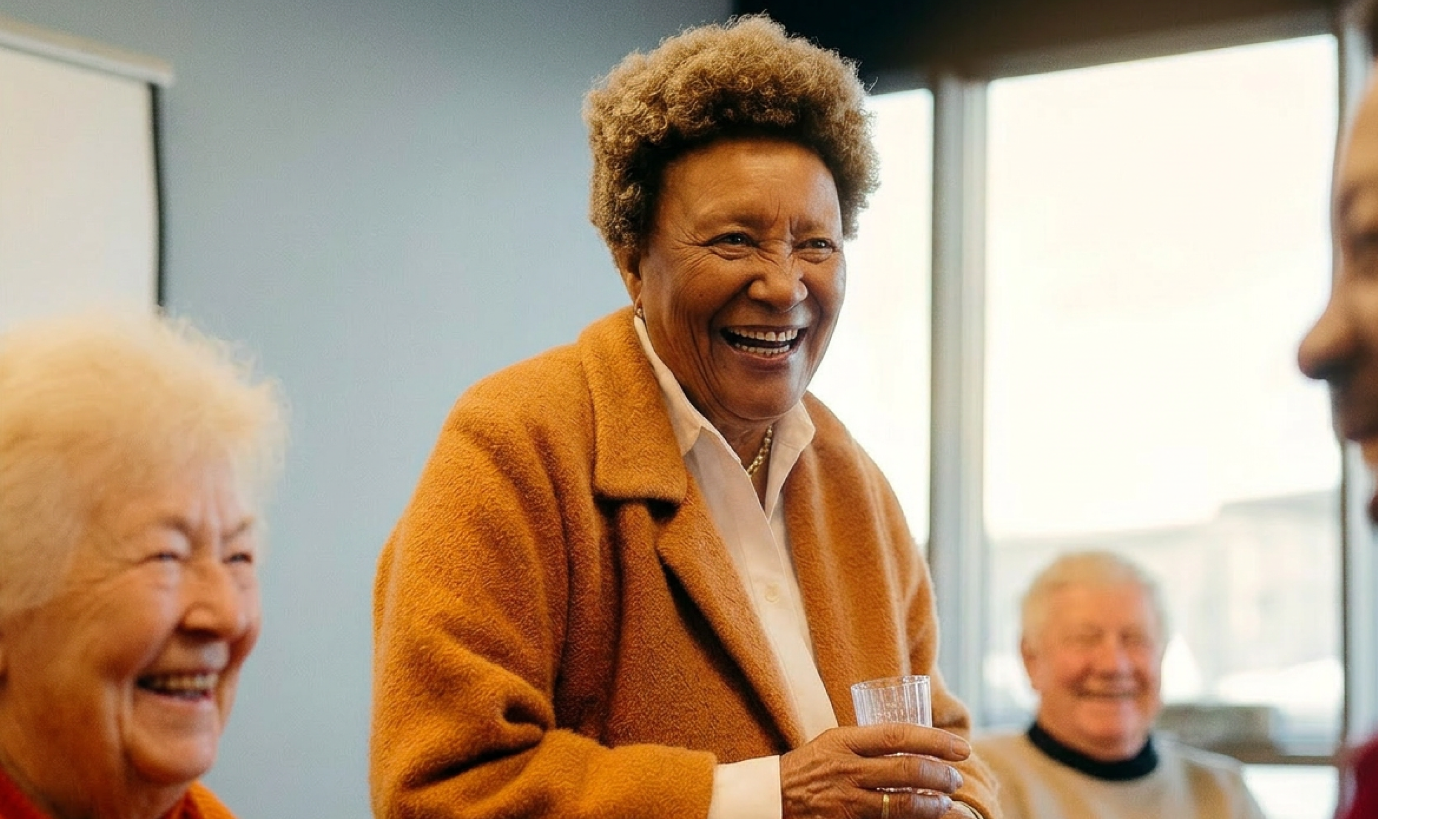

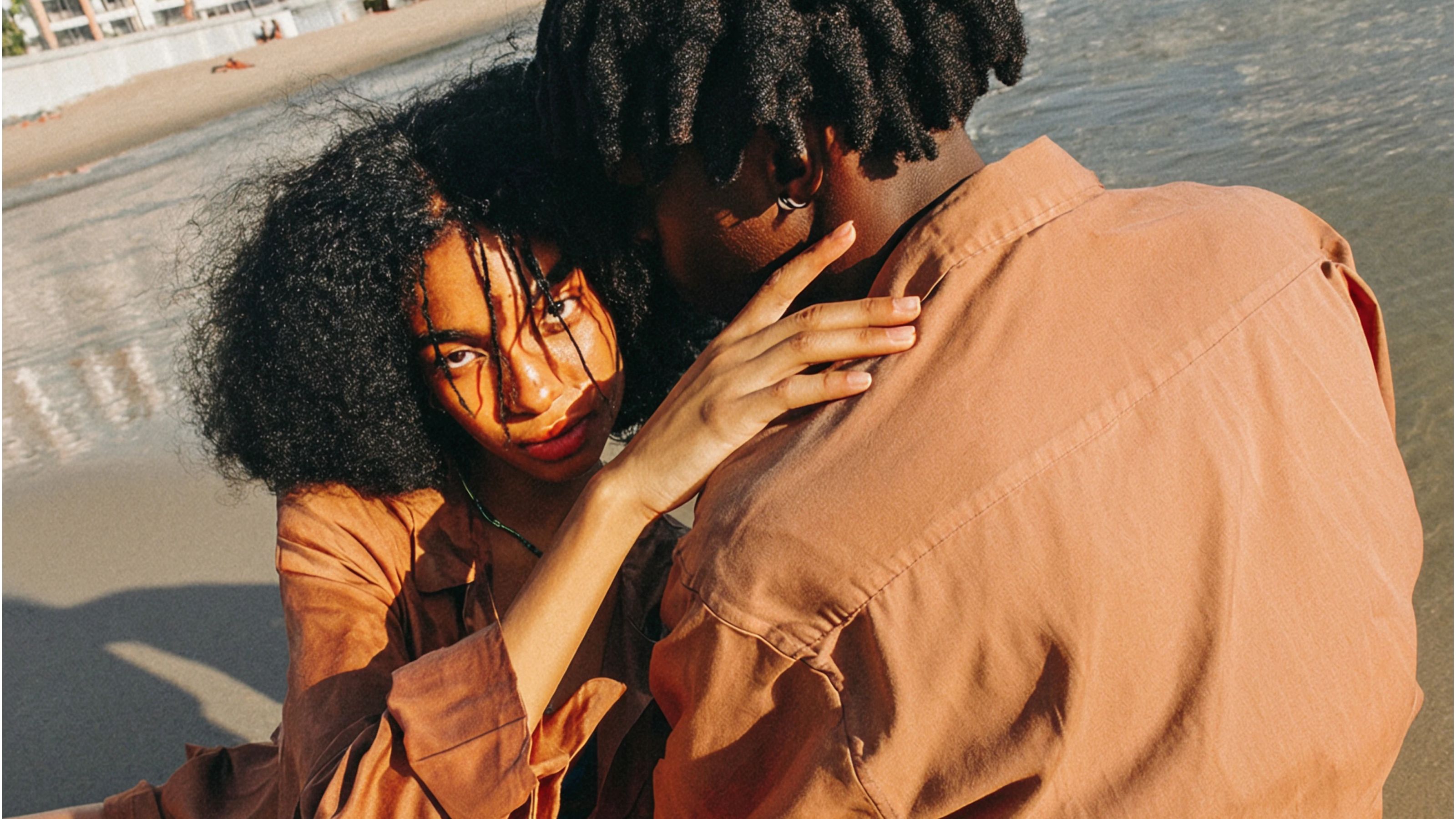


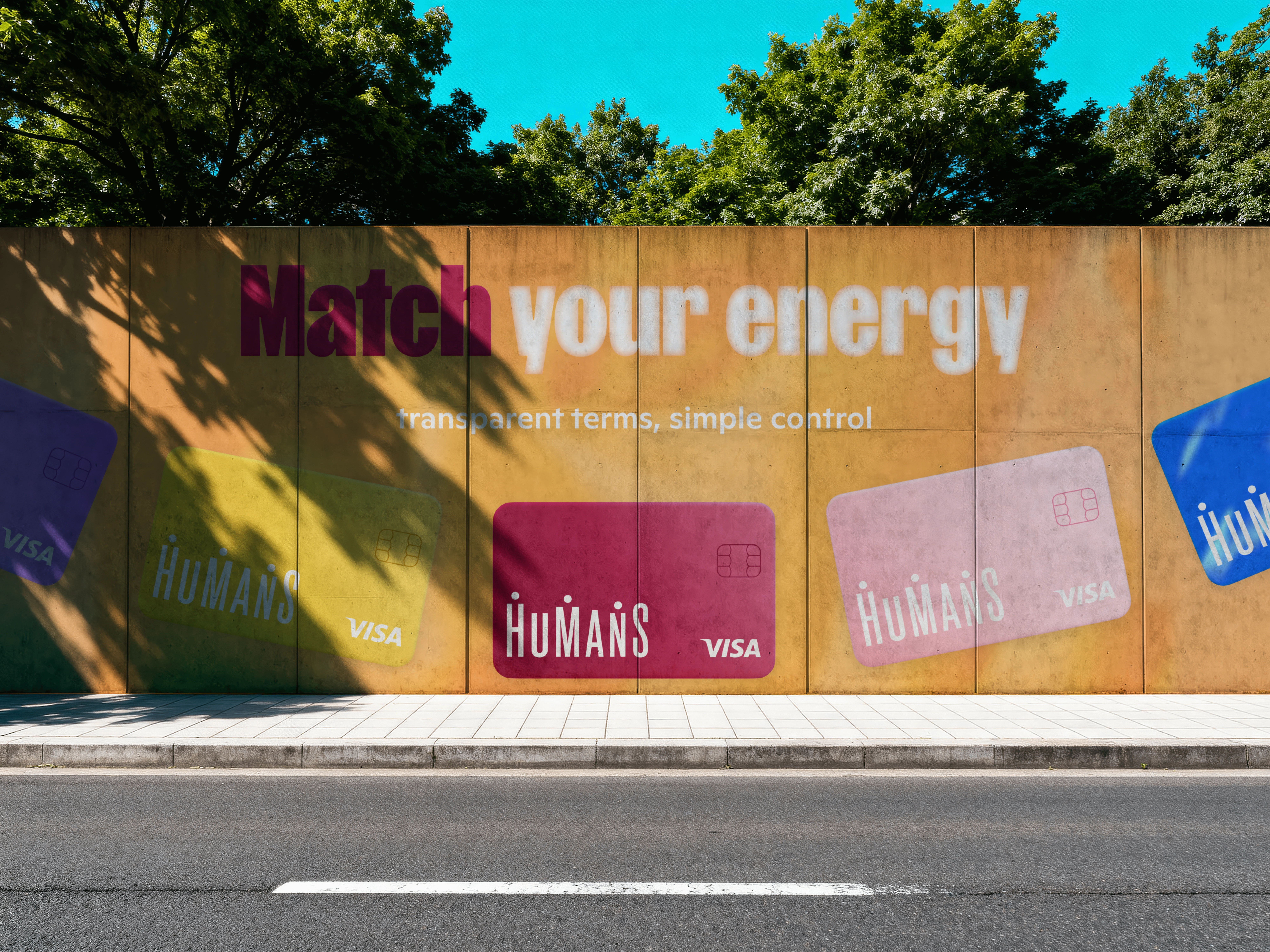


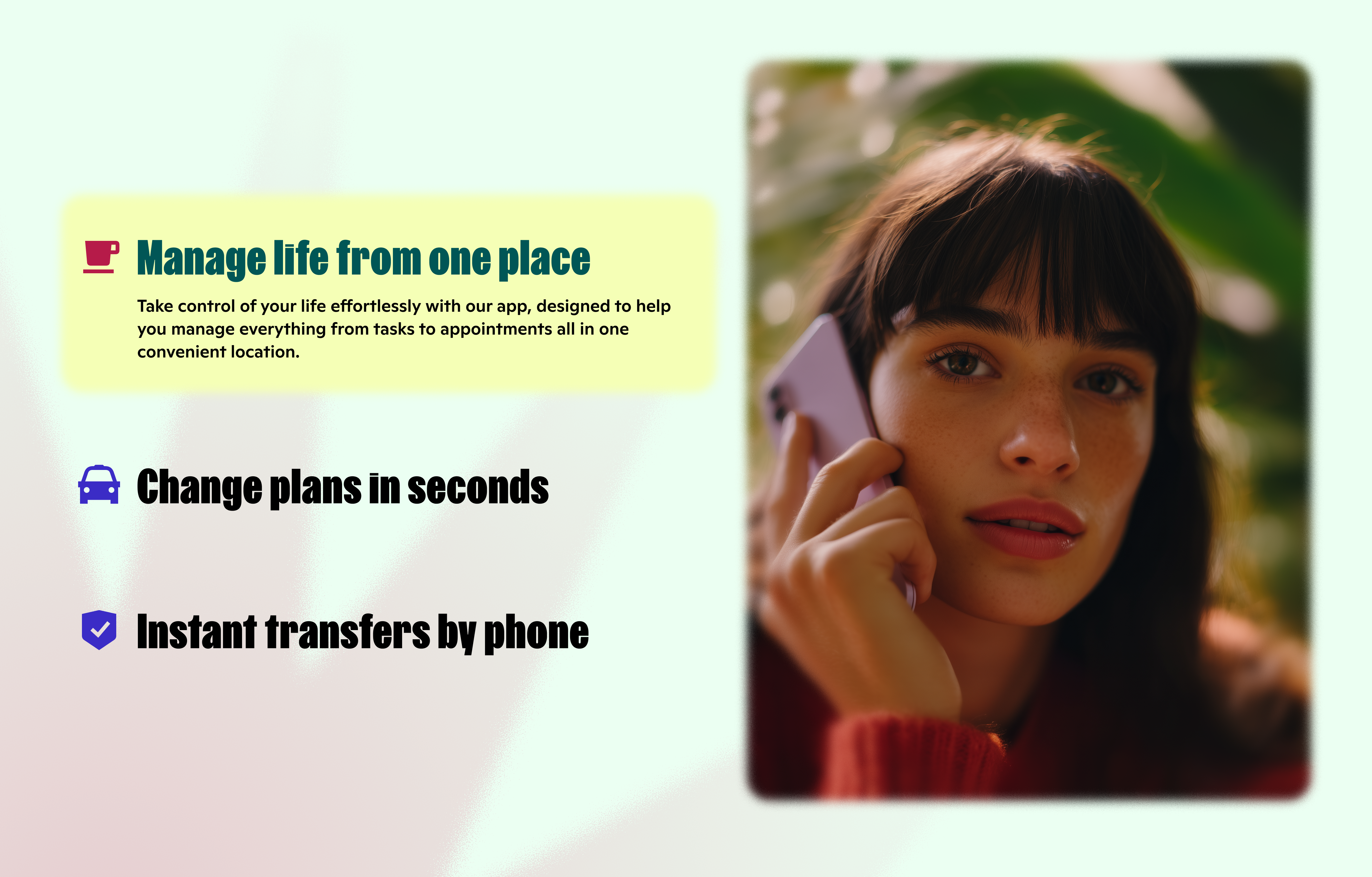
The result is a concept for a more expressive Humans product: bright, energetic and human, but still grounded in everyday utility. The work created a direction for how the app, website and category system could speak the same language — turning a complex mix of telecom, banking and marketplace features into a clearer and more emotional digital experience.
Details
Scope
Concept, design, AI
Year
2026
Font used
FK Screamer, ABC Ginto Plus
Team
Art direction
Sergey Galtsev